Box and Whisker Plot Explained: Read, Calculate, and Compare Data
Quick Answer: What a Box and Whisker Plot Shows
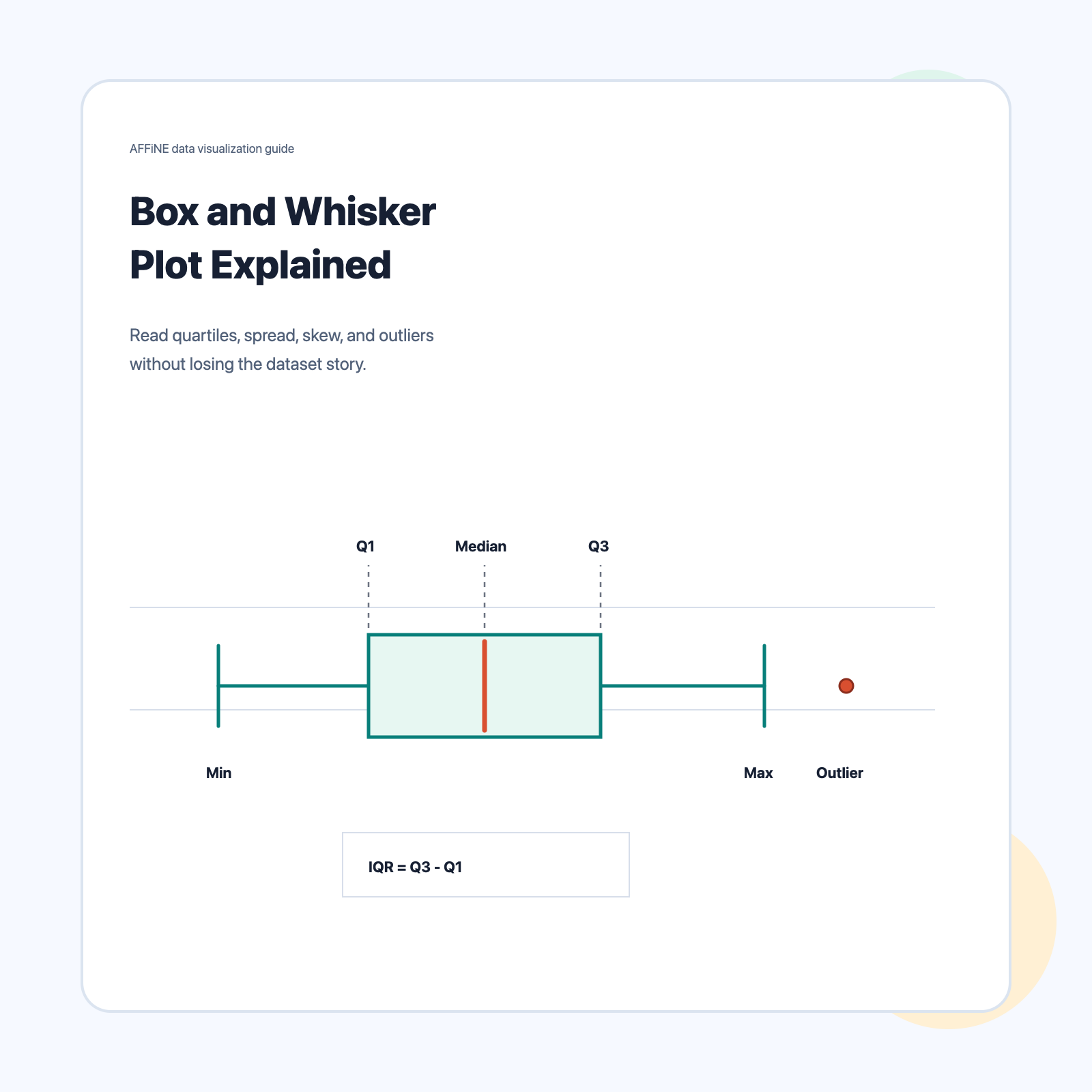
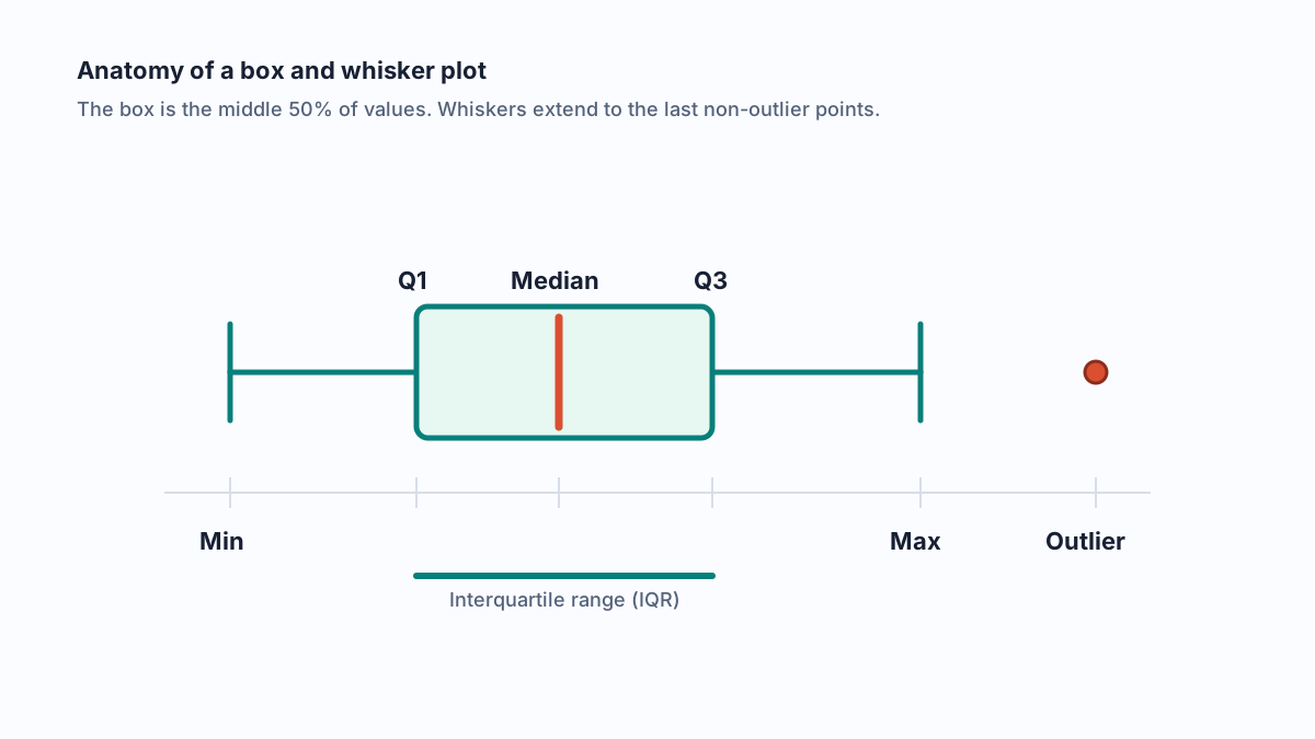
A box and whisker plot, often shortened to a box plot, summarizes a numeric dataset with five values: minimum, first quartile (Q1), median, third quartile (Q3), and maximum. The box spans Q1 to Q3, the line inside the box is the median, and the whiskers show the non-outlier range under the rule you choose.
Use a box plot when you need to answer three questions quickly:
| Question | What to inspect | What it tells you |
|---|---|---|
| Where is the center? | Median line | The typical middle value |
| How spread out is the middle half? | Box length, or IQR | Core variability without outlier distortion |
| Are there unusual values or long tails? | Whiskers and outlier points | Potential skew, heavy tails, or values to investigate |
This makes box plots especially useful for comparing distributions across classes, teams, experiments, time periods, or product cohorts. A histogram is often better for seeing the full shape of one dataset, but side-by-side box plots are faster when you need to compare several groups on the same scale.
Build the Plot from the Five-Number Summary
The five-number summary is the backbone of every box plot:
- Sort the data from smallest to largest.
- Identify the minimum and maximum values.
- Find the median, or Q2.
- Find Q1, the median of the lower half of the data.
- Find Q3, the median of the upper half of the data.
The interquartile range is:
IQR = Q3 - Q1
The IQR is useful because it describes the middle 50% of the data. It is less sensitive to extreme values than the full range, which is why analysts often prefer it when a dataset is skewed or has outliers.
A Small Worked Example
Suppose these are the sorted response times, in seconds:
| Value | 12 | 15 | 18 | 21 | 22 | 24 | 27 | 31 | 38 | 70 |
|---|
One common median-of-halves method gives:
| Statistic | Value | Meaning |
|---|---|---|
| Minimum | 12 | Smallest observed value |
| Q1 | 18 | 25th percentile area |
| Median | 23 | Middle of the dataset |
| Q3 | 31 | 75th percentile area |
| Maximum | 70 | Largest observed value |
| IQR | 13 | Middle-half spread, Q3 - Q1 |
Different tools can calculate quartiles with slightly different algorithms, so do not treat small Q1/Q3 differences as errors until you have checked the method.
Use the 1.5×IQR Rule for Outliers
Most modern modified box plots use Tukey's 1.5×IQR rule. The rule creates two fences:
| Fence | Formula |
|---|---|
| Lower fence | Q1 - 1.5 × IQR |
| Upper fence | Q3 + 1.5 × IQR |
Any value outside those fences is flagged as a potential outlier. The whiskers extend to the most extreme data points that still fall inside the fences, not necessarily to the true minimum and maximum.
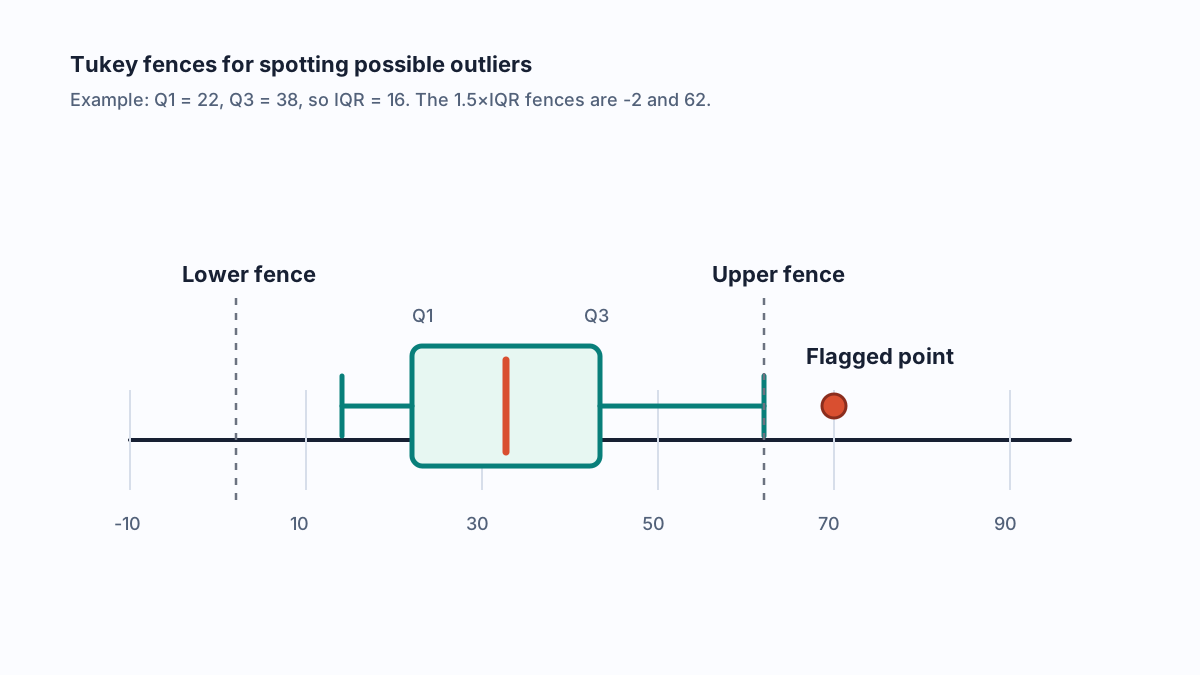
Outliers are not automatically mistakes. They can be data entry errors, measurement problems, rare but valid events, or the most important part of the story. The right reporting habit is to say how outliers were detected and what you did next.
How to Read a Box Plot in Seconds
When you see a box plot, read it in this order:
- Median: Which group has the higher or lower middle value?
- IQR: Which group has more variation in the middle 50%?
- Whiskers: Are one or both tails long?
- Outliers: Are there points beyond the whiskers, and do they have a domain explanation?
- Sample size: How many observations are behind each box?
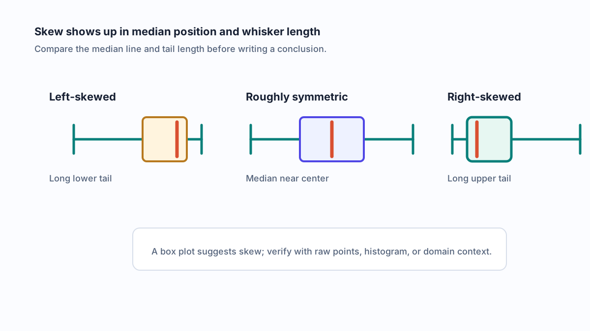
Long boxes mean the central values are spread out. Short boxes mean the central values are tightly grouped. A median close to Q1 or Q3 suggests skew, especially when one whisker is much longer than the other.
Comparing Multiple Groups
Side-by-side box plots are strongest when every group uses the same axis, quartile method, and whisker rule. Compare medians first, then IQRs, then whiskers and outliers.
Avoid saying that one group is "better" just because its median is higher. In many real cases, a wider IQR means less predictability, and that uncertainty may matter more than a small median difference.
Know the Limits Before You Publish the Chart
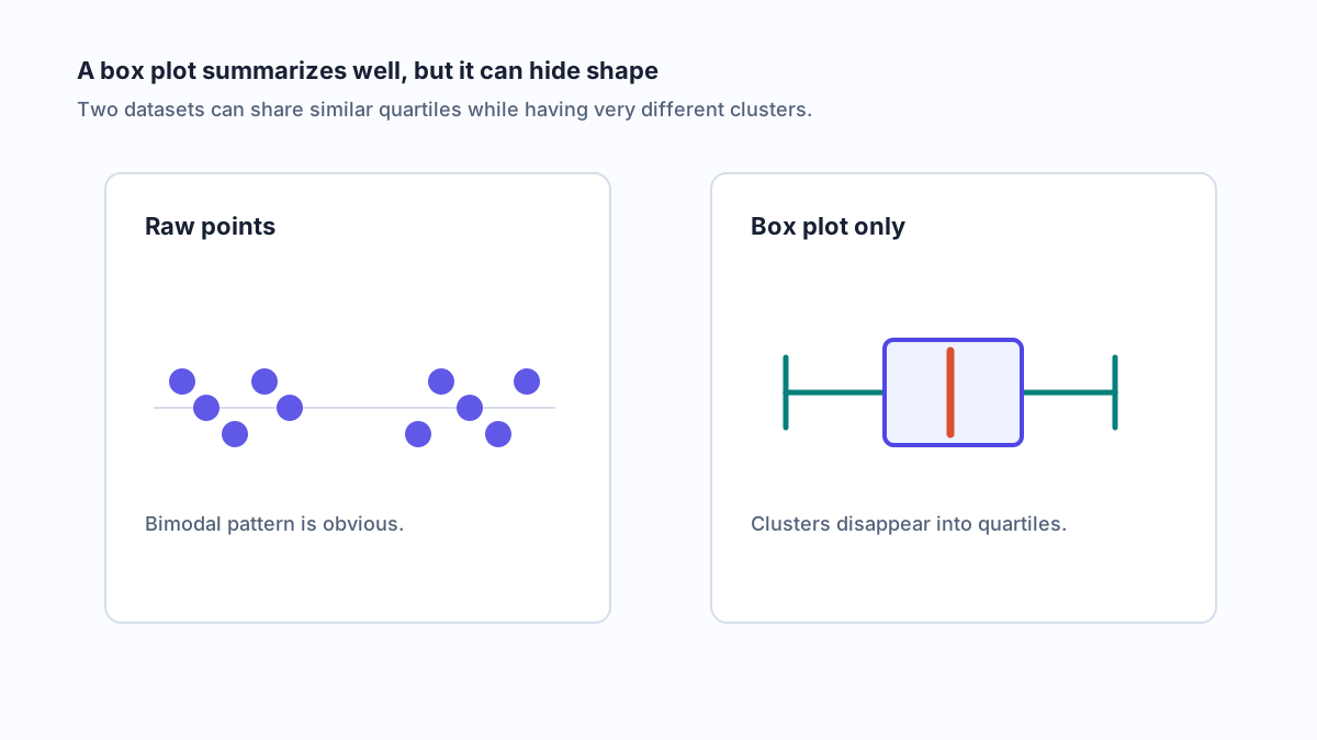
A box plot is compact because it discards detail. That is a strength for comparison, but it can also hide important patterns.
Watch for these limitations:
| Limitation | Why it matters | Better companion |
|---|---|---|
| Hidden clusters or multiple peaks | Two very different distributions can have similar quartiles | Histogram, density plot, or violin plot |
| No sample size by default | A box based on 8 values is less stable than a box based on 800 | Add n labels or a summary table |
| Outliers can dominate attention | A flagged point may be valid or invalid depending on context | Show investigation notes |
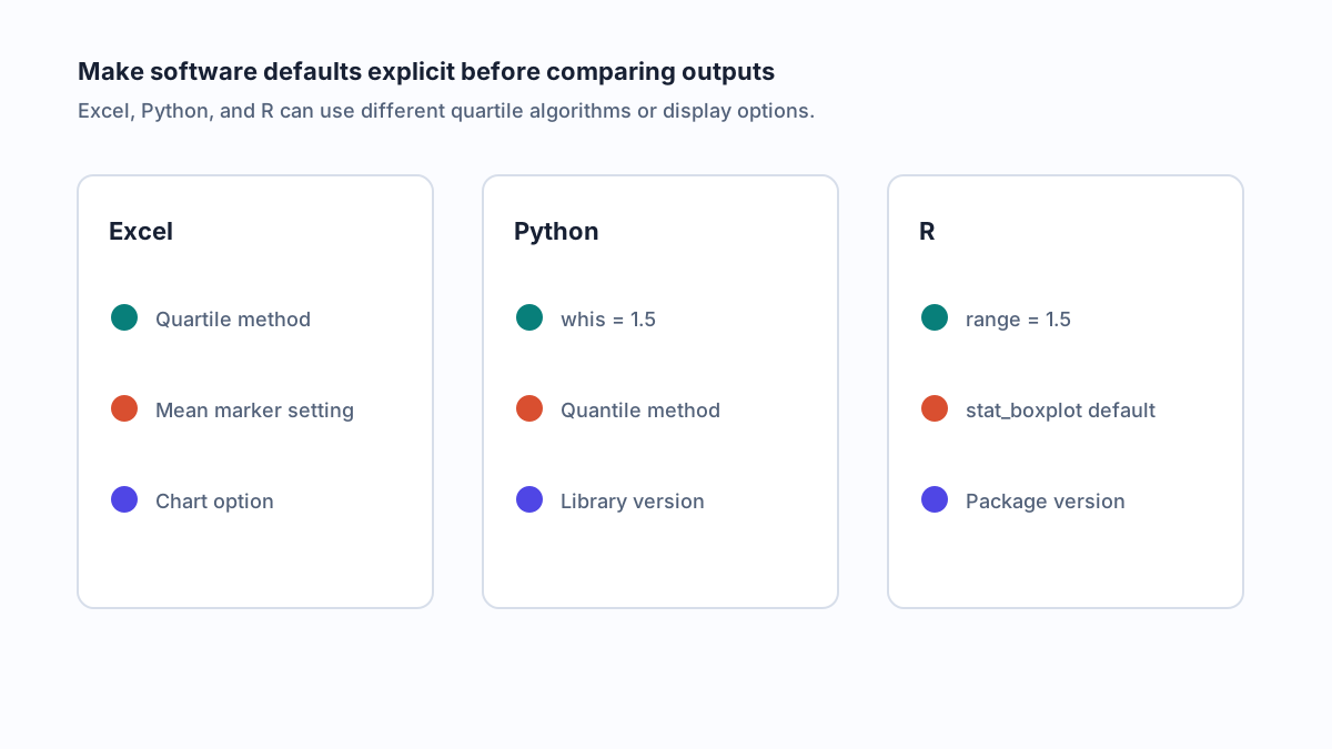
| Quartile methods differ | Excel, Python, R, and calculators may not match exactly | State the tool and method |
For small samples, show the raw points as well. For larger samples, consider pairing the box plot with a histogram or violin plot so readers can see the distribution shape.
Create a Box and Whisker Plot in Excel, Python, or R
The mechanics differ by tool, but the reporting discipline is the same: state the software, sample size, quartile method if relevant, and whisker rule.
Excel
- Put each group of values in its own column.
- Select the data range.
- Choose Insert > Statistic Chart > Box & Whisker.
- Review the series options, including mean markers and quartile calculation.
Excel is convenient for quick reporting, but it is worth documenting the version and chart settings if the plot is part of an analysis that others need to reproduce.
Python
Python's Matplotlib can create a box plot with one call:
import matplotlib.pyplot as plt

scores = [
    [12, 15, 18, 21, 22, 24, 27, 31, 38, 70],
    [14, 16, 19, 20, 23, 24, 25, 28, 30, 33],
]

plt.boxplot(scores, whis=1.5, labels=["Group A", "Group B"], patch_artist=True)
plt.ylabel("Response time (seconds)")
plt.title("Response time distribution by group")
plt.show()
The whis=1.5 parameter makes the Tukey fence explicit. If you calculate quartiles separately with NumPy or pandas, document that method too.
R
Base R and ggplot2 both support box plots:
df <- data.frame(
  group = rep(c("Group A", "Group B"), each = 10),
  seconds = c(12, 15, 18, 21, 22, 24, 27, 31, 38, 70,
              14, 16, 19, 20, 23, 24, 25, 28, 30, 33)
)

boxplot(seconds ~ group, data = df, range = 1.5,
        ylab = "Response time (seconds)")
R's range = 1.5 uses the standard 1.5×IQR whisker rule. As with Python, reproducible work should mention the package and version.
Report Box Plots with Enough Method Detail
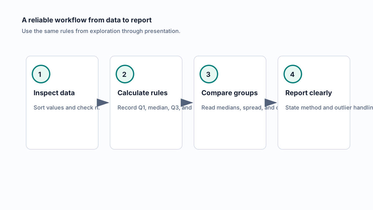
A good box plot caption should give readers enough information to recreate the chart. Use a sentence like this:
Data are summarized with box plots showing the median and interquartile range. Whiskers extend to the last observed point within 1.5×IQR of Q1 and Q3, and points beyond the whiskers are flagged as possible outliers.
For research, operations, or classroom work, add a compact table:
| Group | n | Median | IQR | Whisker rule | Outlier handling |
|---|---|---|---|---|---|
| Group A | 1.5×IQR | ||||
| Group B | 1.5×IQR |
Where AFFiNE Fits in the Workflow
A statistical tool creates the plot, but the interpretation usually happens across notes, tables, follow-up questions, and presentation drafts. AFFiNE helps keep that work together: place the plot on an edgeless canvas, add the five-number summary, write assumptions beside the chart, and turn the analysis into a shareable report.
If you are still shaping the visual story, see the Chart Maker Playbook for chart selection guidance, the scatter plot guide when relationships between two variables matter, and the table maker guide when a summary table is the clearest companion.
FAQ About Box and Whisker Plots
How do you summarize a box and whisker plot?
Summarize the median, IQR, whiskers, and outliers. The median gives the center, the IQR gives the middle-half spread, the whiskers show the non-outlier range under the chosen rule, and the outlier points identify values that deserve context.
What is the main advantage of a box plot over a histogram?
A box plot makes it easy to compare several groups on one scale. A histogram is better for seeing the detailed shape of one distribution, but side-by-side histograms become harder to compare as the number of groups grows.
How does a box plot show skew?
Skew appears when the median is off-center within the box or one whisker is much longer than the other. A long upper whisker and median near Q1 suggest right skew. A long lower whisker and median near Q3 suggest left skew.
Are box plot outliers always errors?
No. Outliers are values beyond a rule-based threshold, usually 1.5×IQR. They may be errors, but they may also be valid rare events. Investigate them before removing or downplaying them.
Why do Excel, Python, and R box plots sometimes disagree?
They may use different quartile algorithms, interpolation choices, or display defaults. If the plot supports a decision, report the tool, version, quartile method, sample size, and whisker rule.
When should you avoid a box plot?
Avoid using a box plot alone when the distribution shape matters, the sample size is tiny, or clusters and gaps are important. Pair it with raw points, a histogram, or a violin plot for a more complete picture.