Venn Diagram: Definition, Examples, and Templates
What Is a Venn Diagram?
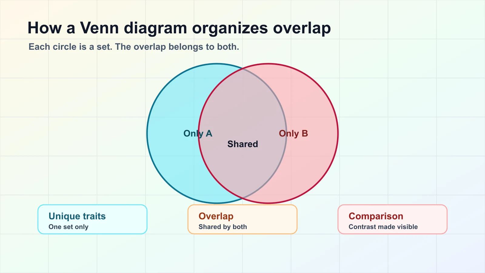
A Venn diagram is a visual comparison tool that uses overlapping shapes to show how groups, ideas, or data sets relate to each other. Each circle represents a set. The overlap shows what the sets share. The areas that do not overlap show what is unique to each set.
That simple structure makes a Venn diagram useful for quick compare-and-contrast work: a teacher can compare two texts, a product team can compare feature requests, and a researcher can show where sample groups share a trait. The goal is not decoration. The goal is to make a relationship easier to understand at a glance.
Quick answer:
| Question | Practical answer |
|---|---|
| What does a Venn diagram show? | Similarities, differences, and shared elements between sets. |
| When should you use one? | When the main insight is about overlap or contrast. |
| How many circles work best? | Two or three for most audiences; more only when the added detail is necessary. |
| What is the biggest mistake? | Adding too many sets or labels until the diagram becomes harder to read than a list. |
Why Venn Diagrams Are Useful
Venn diagrams are useful because they turn a list of relationships into a visible structure. Instead of asking readers to scan several paragraphs or rows of data, the diagram makes the most important question obvious: what is shared, and what is different?
Use a Venn diagram when you need to:
- Compare two products, texts, audiences, or ideas.
- Explain shared requirements across teams or stakeholders.
- Sort research findings into unique and common patterns.
- Teach set relationships, probability, classification, or logic.
- Find a decision option that satisfies more than one criterion.
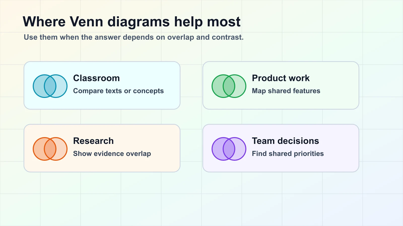
They are especially strong for early-stage thinking. Before a team commits to a plan, a Venn diagram can reveal overlap between user needs, technical feasibility, and business value. Before students write an essay, it can help them organize evidence from two sources. Before a product comparison page goes live, it can show which features are shared and which deserve separate positioning.
When Not to Use a Venn Diagram
A Venn diagram is not the right tool for every relationship. If your data is mainly sequential, use a timeline or flowchart. If your data is hierarchical, use an org chart, tree diagram, or concept map. If you need exact numeric comparison, a table or chart may be clearer.
Avoid a Venn diagram when:
- You have more than four sets and every overlap must be explained.
- The overlaps are too small or too numerous to label clearly.
- The audience needs exact quantities rather than relationship patterns.
- The groups are not comparable in the first place.
A helpful rule: if the diagram does not make the answer faster to understand, choose another format. AFFiNE users often pair a Venn diagram with a concept map when the work moves from comparison into broader idea structure.
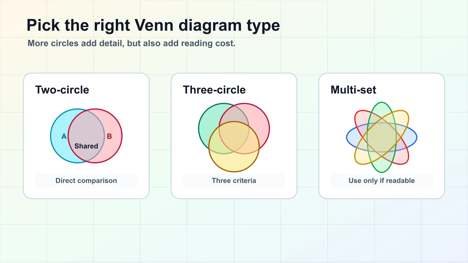
Venn Diagram Types
The simplest Venn diagrams are usually the best. The right type depends on how many sets you need to compare and how much detail your audience can read without slowing down.
Two-Circle Venn Diagram
A two-circle Venn diagram compares two sets. It is the best choice for direct comparisons such as Apple vs. Android, novel vs. film adaptation, or customer segment A vs. customer segment B. Each side shows unique traits, and the middle shows what both sides share.
Three-Circle Venn Diagram
A three-circle Venn diagram compares three sets. It works well when a decision depends on three criteria, such as user value, feasibility, and revenue potential. The center overlap is often the most important area because it shows what satisfies all three conditions.
Four-Circle and Multi-Set Diagrams
A multi-set Venn diagram can be useful for advanced analysis, but it becomes hard to read quickly. With four sets, the number of possible regions increases sharply. In many business or classroom situations, a matrix, table, or graphic organizer will communicate the same information more clearly.
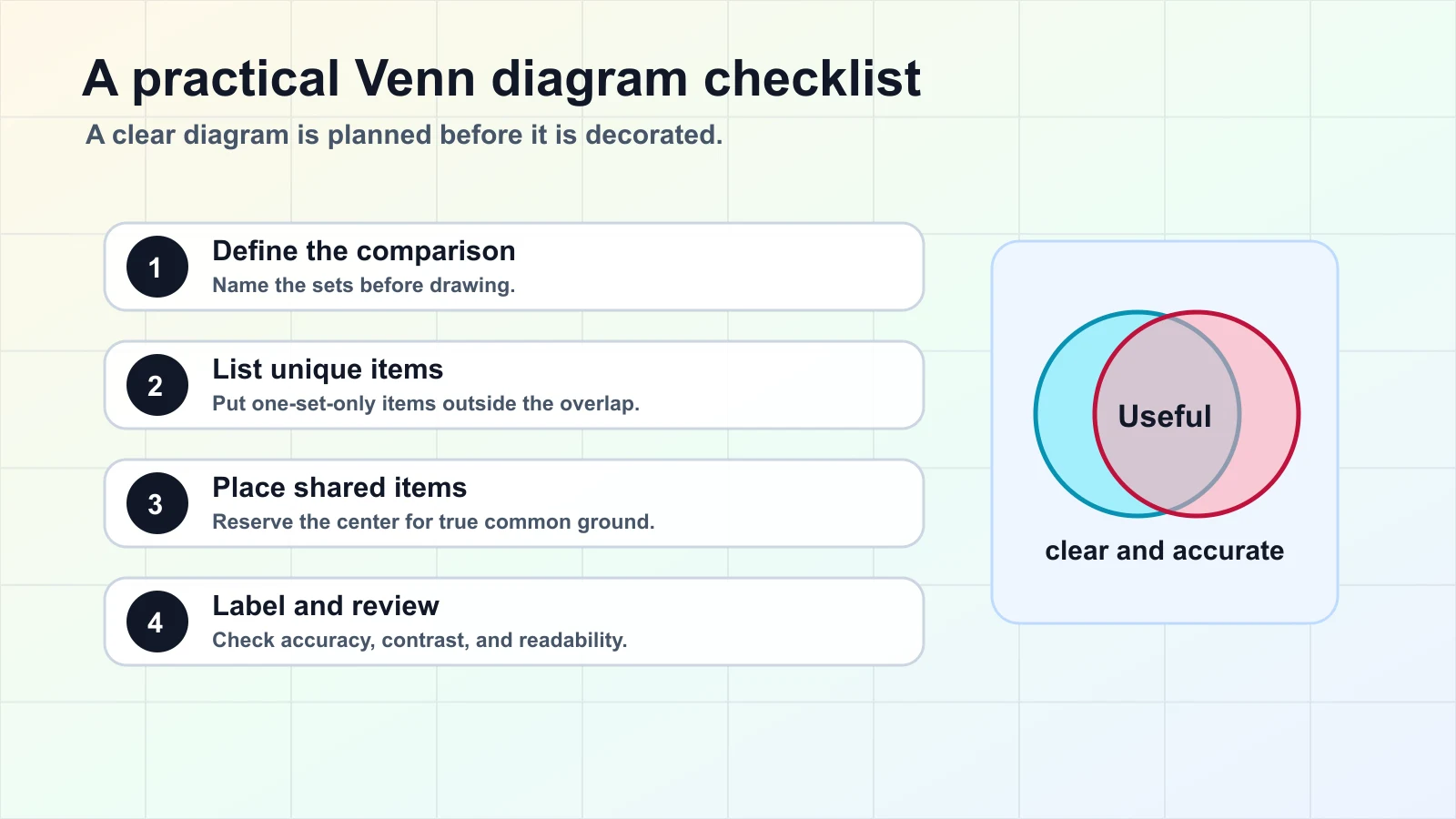
How to Create a Clear Venn Diagram
Follow this process before opening a design tool. It keeps the diagram accurate, readable, and useful.
- Define the comparison.
Name each set in plain language. A weak label like "Option 1" makes the diagram harder to understand. A strong label like "Features students need" tells readers what the circle means.
- List the items first.
Before drawing, make a rough list of all elements you plan to place in the diagram. This prevents you from forcing items into the wrong area just because the layout is already drawn.
- Put unique items outside the overlap.
If an item belongs only to one set, keep it in that set's non-overlapping area. This is what makes the contrast useful.
- Put shared items in the correct overlap.
Only place an item in the center if it truly belongs to every relevant set. For a three-circle Venn diagram, check whether an item belongs to two sets or all three.
- Keep labels short.
Use short phrases in the diagram and explain details below it. Long labels make circles crowded and reduce the value of the visual.
- Review the diagram against the original question.
Ask whether the diagram answers the comparison question better than a list would. If it does not, simplify it or choose a different visual.
Practical Venn Diagram Examples
Example 1: Comparing Two Products
Imagine a team comparing two project tools. One circle is "Tool A" and the other is "Tool B." Shared features might include task lists, comments, and file attachments. Tool A might uniquely offer local-first editing. Tool B might uniquely offer a specific reporting dashboard. The diagram helps the team discuss fit instead of arguing from memory.
Example 2: Planning Classroom Discussion
A teacher comparing two characters can place traits unique to each character in the outer areas and shared motivations or conflicts in the overlap. Students can then turn the diagram into a paragraph outline.
Example 3: Research and Survey Analysis
A researcher can compare respondents who use product feature A and respondents who use product feature B. The overlap identifies people who use both, which may reveal a power-user segment worth studying separately.
Example 4: Team Prioritization
A three-circle Venn diagram can compare "high user impact," "easy to ship," and "strategic value." Ideas in the center are strong candidates for the next sprint. Ideas outside the center may still matter, but they need a different discussion.
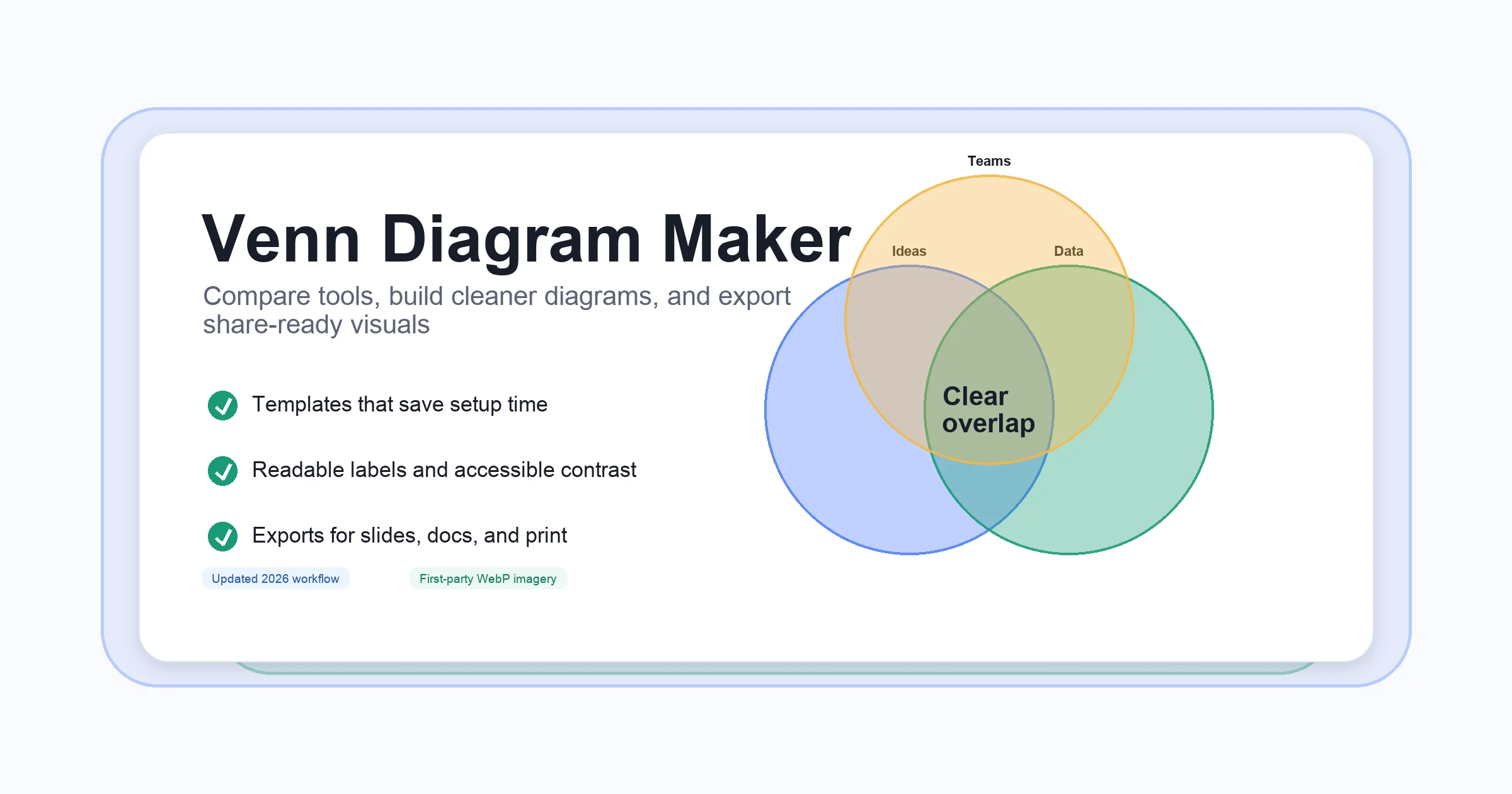
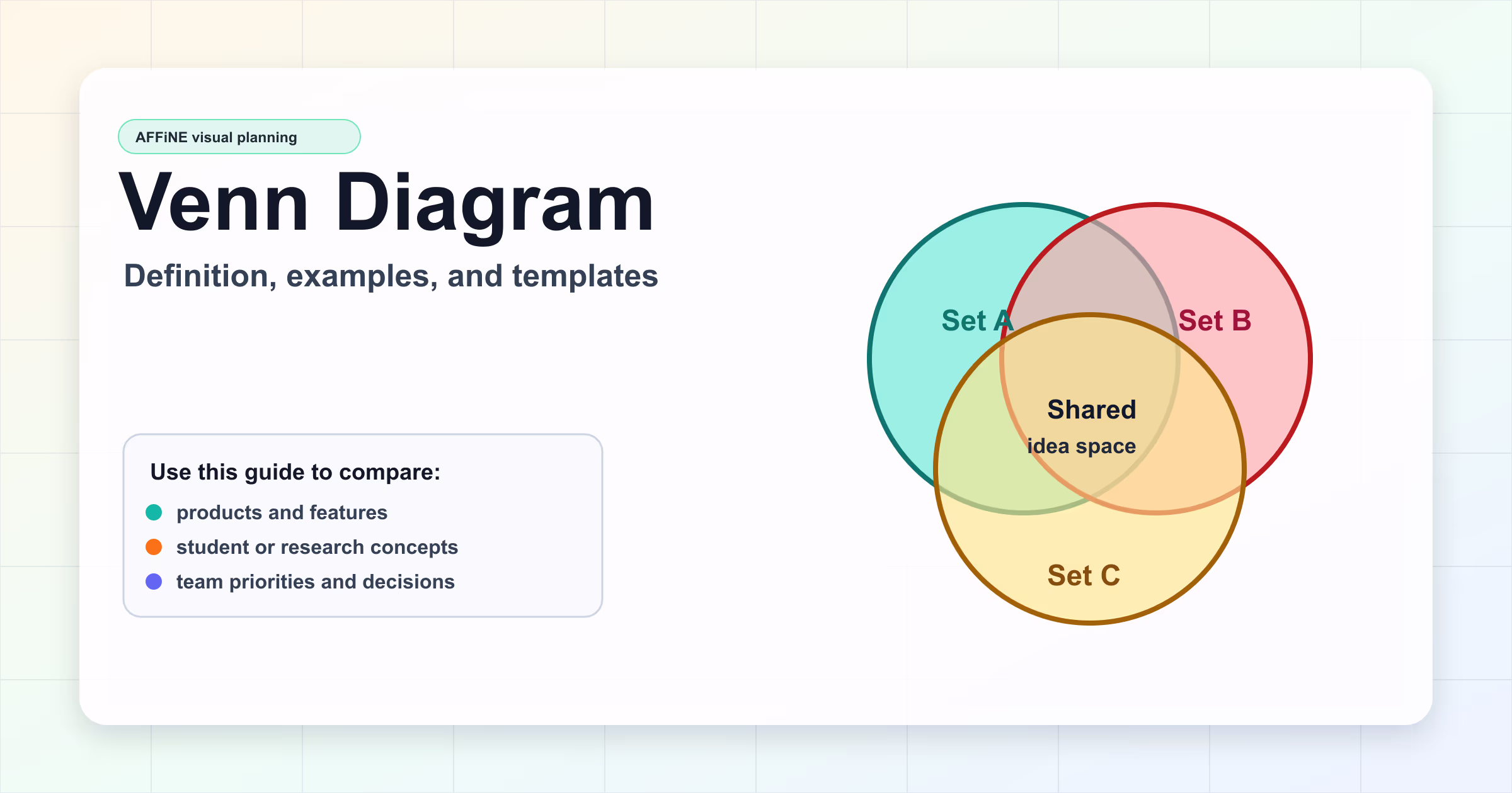
Venn Diagram Templates and Tools
You can sketch a Venn diagram on paper, but a template helps when the diagram needs to be shared, edited, or reused. A good template gives you enough structure to start quickly without locking you into a rigid design.
Use AFFiNE's Venn Diagram Template when you want the diagram to live next to notes, research, and next steps. You can also use the Venn Diagram Maker guide if you are comparing tools and need help choosing a workflow.
A strong template should support:
- Editable labels and shapes.
- Enough white space for readable text.
- Simple color contrast between sets.
- Export or sharing options for reports, lessons, and team docs.
- Room for supporting notes outside the diagram.
AFFiNE is useful here because a Venn diagram does not usually stand alone. It is part of a thinking process: collect evidence, compare options, decide what matters, and turn the result into a plan.
Common Venn Diagram Mistakes
Mistake 1: Treating Every Diagram as a Venn Diagram
Not every overlap-style visual is a true Venn diagram. A Venn diagram shows possible relationships between sets. If you only show relationships that exist in the data, you may be closer to an Euler diagram. For everyday content, the distinction is less important than clarity, but it matters in math and logic contexts.
Mistake 2: Using Too Many Circles
Adding circles can make the page look more detailed while making the insight harder to read. If the audience cannot explain the diagram after a few seconds, reduce the number of sets.
Mistake 3: Writing Full Sentences Inside the Circles
A diagram is not a paragraph container. Put short labels in the circles and move details into bullets below the image.
Mistake 4: Forgetting the Decision
A Venn diagram should support a purpose. Define the question first: What are we comparing? What should the reader learn? What decision or explanation should this make easier?
FAQ About Venn Diagrams
What is a Venn diagram in simple terms?
A Venn diagram is a drawing that shows how groups overlap. Each circle represents a group or set, and the overlapping area shows what the groups have in common.
What is a Venn diagram best used for?
A Venn diagram is best used for compare-and-contrast tasks. It helps readers see similarities, differences, and shared traits between two or more sets.
How do you make a Venn diagram?
Start by naming the sets you want to compare. List the items that belong to each set, place shared items in the overlap, place unique items in the outer areas, and then review the labels for accuracy and readability.
What is the difference between a Venn diagram and an Euler diagram?
A Venn diagram shows all possible logical regions between sets, even when some regions are empty. An Euler diagram shows only the relationships that exist in the data, which can make it cleaner for complex real-world examples.
Can a Venn diagram have more than three circles?
Yes, but it becomes harder to read. Two- and three-circle Venn diagrams work best for most content, teaching, and planning tasks. For many sets, consider a matrix, table, or concept map instead.
Final Takeaway
A good Venn diagram is clear before it is clever. Use it when overlap is the main insight, keep labels short, and choose the simplest layout that answers the question. If you want a reusable starting point, open AFFiNE's Venn Diagram Template and keep your diagram, notes, and decisions in one workspace.