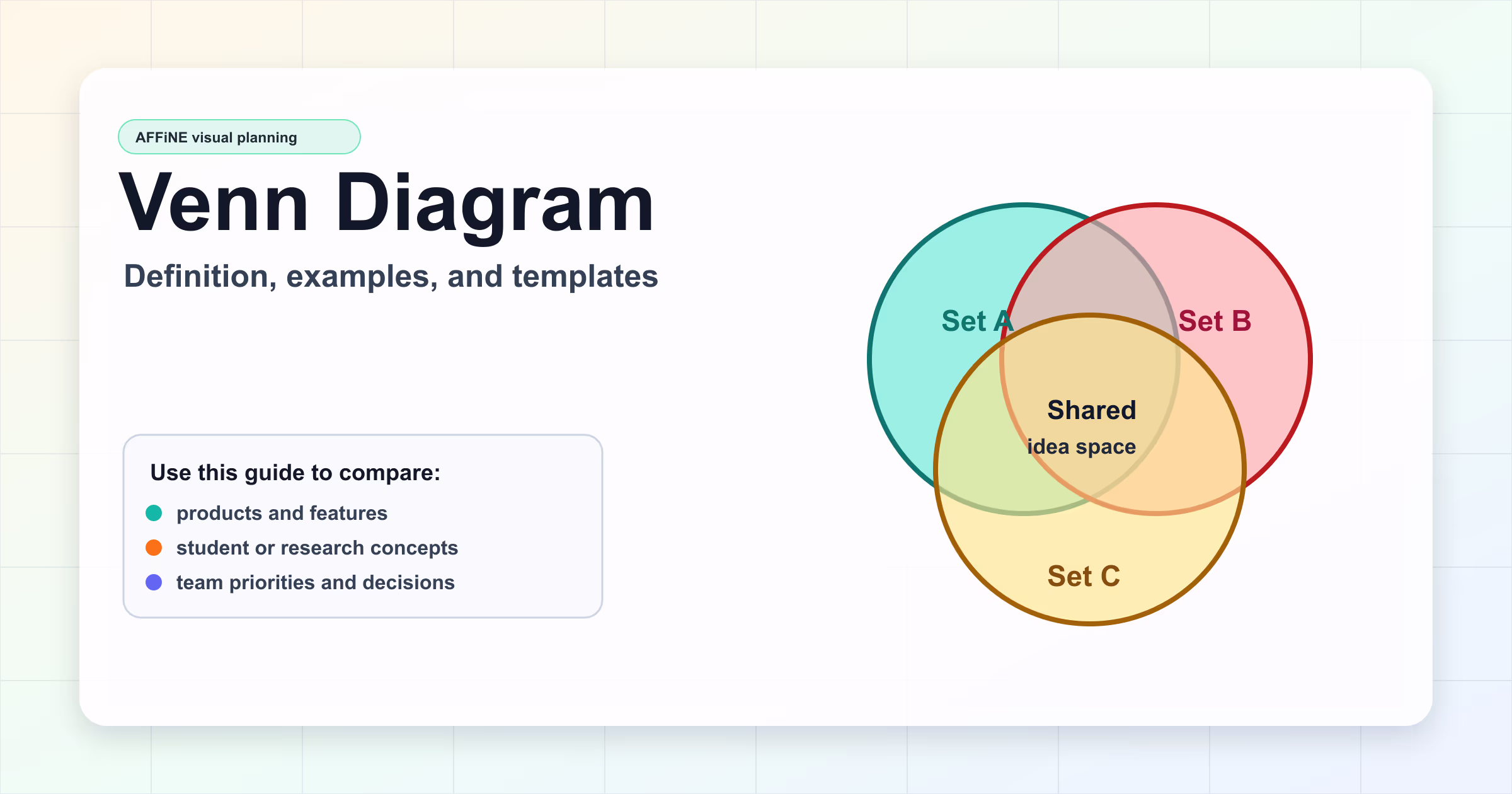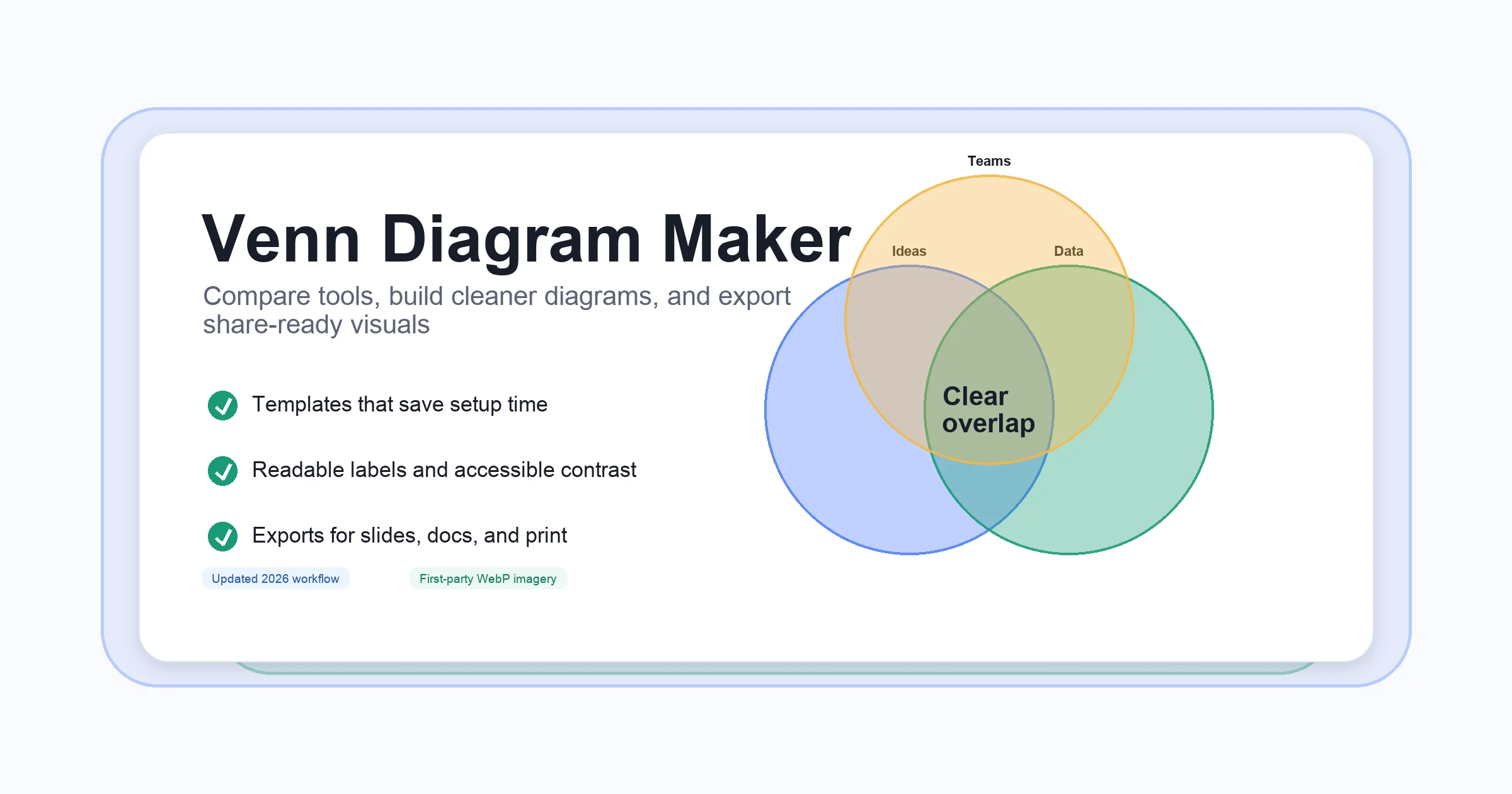
Venn Diagram Maker: Top Tools, Free Picks & Pro Tips
Introduction to Venn Diagram Maker Solutions
Updated June 27, 2026: this guide was refreshed with first-party WebP diagrams, descriptive image alt text, clearer tool-selection criteria, and stronger internal links for Venn diagram workflows.
Ever tried to compare two teams, analyze overlapping customer segments, or break down a complex logic puzzle—only to be overwhelmed by the details? That’s where Venn diagrams step in. These simple, overlapping circles have become a universal language for illustrating how different sets relate to each other. But what exactly makes them so powerful, and how can a Venn diagram maker help you bring clarity to your ideas?
Quick answer: A Venn diagram maker is a digital tool for building overlapping-circle diagrams that show shared and unique traits between sets. Use one when you need faster setup, cleaner labels, collaboration, or exports for slides, reports, and printable worksheets. If you only need the underlying concept first, start with the Venn diagram definition guide; if you are ready to build, open the AFFiNE Venn Diagram Template and keep your notes, diagram, and follow-up tasks in one workspace.
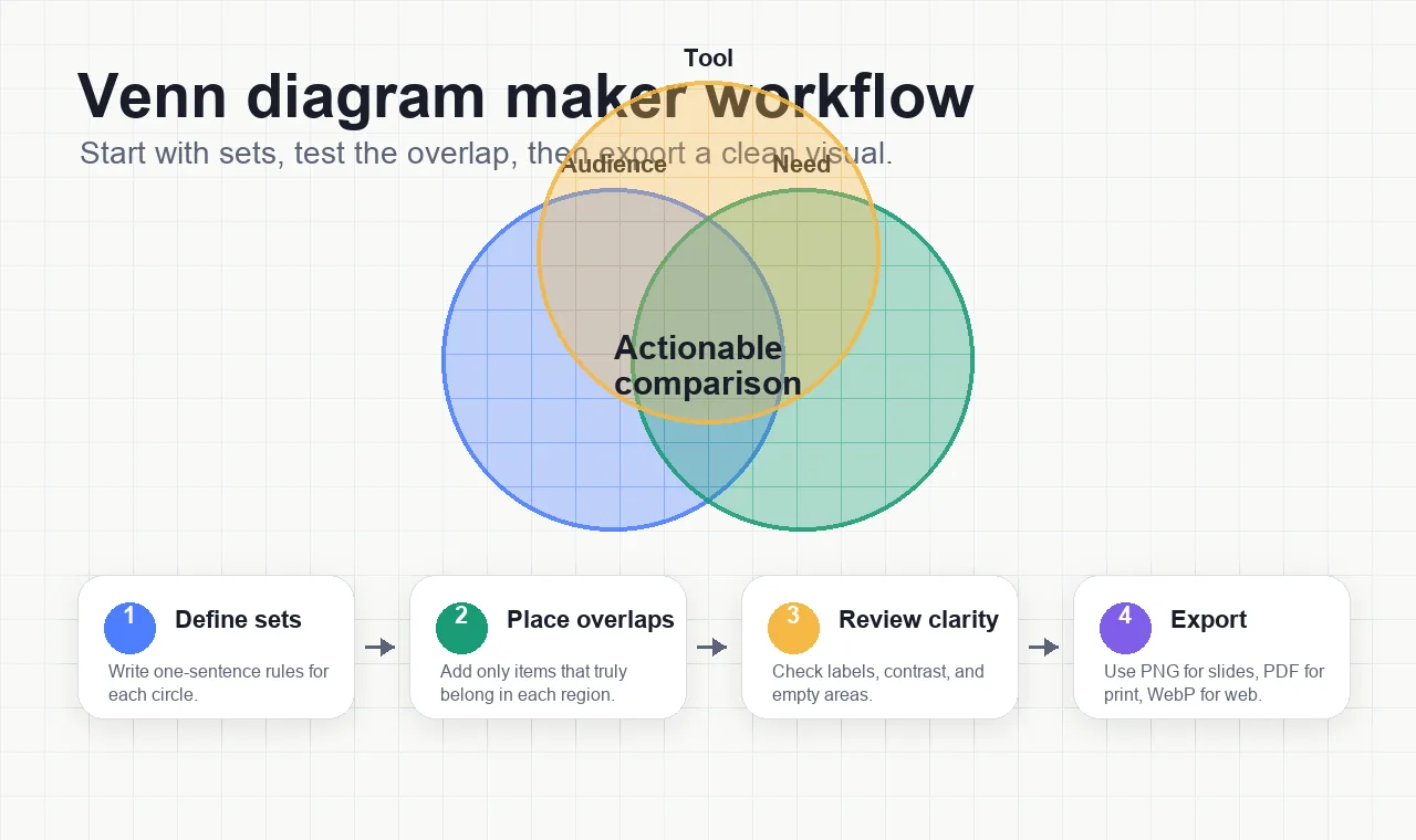
Quick Workflow: Build a Venn Diagram That Stays Readable
-
Define each set in one sentence. A useful Venn diagram starts with clear set rules, not decoration.
-
Choose two or three circles for most cases. More circles can work, but they quickly reduce readability for meetings, lessons, and search-friendly screenshots.
-
Place the overlap items before styling. Fill the shared regions first so the diagram answers the real comparison question.
-
Review labels, contrast, and empty regions. Every label should be readable at slide size, and every blank area should be intentional.
-
Export the right format for the job. Use PNG for slides, PDF for print, and WebP for web pages where loading speed matters.
What Is a Venn Diagram and Why Does It Matter?
Venn diagrams are visual tools that map out relationships between sets—think of them as a way to show where things overlap, where they differ, and what they share in common. They were introduced in 1880 by British mathematician John Venn, who wanted a clear, visual method for representing logical relationships and set theory. Since then, these diagrams have found a home in classrooms, boardrooms, and research labs, helping people solve logic problems, compare products, and even navigate dinner party guest lists (Scientific American).
-
Comparisons: Quickly spot similarities and differences between two or more groups.
-
Logic and Reasoning: Make sense of complex conditions or rules by visualizing possible outcomes.
-
Statistics and Data Analysis: Highlight overlaps in survey responses, customer segments, or research findings.
From Hand-Drawn Circles to Digital Precision: The Evolution of Venn Diagram Makers
Imagine the days when making a Venn diagram meant grabbing a pencil and sketching overlapping circles on paper. Sounds simple, but as soon as you needed more than three sets—or wanted a polished look for a presentation—it got tricky. Enter the Venn diagram maker: a digital tool designed to help you make a Venn diagram with speed, accuracy, and a professional finish.
-
Efficiency: No more erasing and redrawing—digital makers let you adjust, edit, and rearrange instantly.
-
Accuracy: Perfectly aligned circles, consistent labeling, and reliable proportions make your diagrams easy to read and understand.
-
Professional Appearance: With templates, color palettes, and export options, your diagrams look sharp whether they’re in a report or on a slide.
As technology has evolved, so have these tools. What started as basic drawing software has grown into specialized platforms that offer advanced features like collaboration, data import, and interactive elements—making it easier than ever to communicate complex relationships with clarity. If your comparison needs a knowledge-structure view rather than overlapping sets, use the concept maps guide instead.
What’s Ahead in This Guide?
Ready to take your diagrams to the next level? In this article, you’ll discover:
-
A deep dive into the unique advantages of using a dedicated venn diagram maker
-
Comparisons of top online tools, including their standout features and best use cases
-
How to find and evaluate free options that don’t compromise on quality
-
Step-by-step guides for creating Venn diagrams in popular software like PowerPoint, Word, and Google Workspace
-
Expert tips for designing clear, impactful diagrams that get your message across
Whether you’re mapping out a business strategy, teaching a concept, or making data-driven decisions, mastering the art of Venn diagrams—and the tools that create them—will help you visualize information with confidence and efficiency. For a broader overview of overlapping-circle examples, see Venn diagrams made simple.
Why Use a Dedicated Venn Diagram Maker?
Ever tried to sketch a Venn diagram by hand, only to end up with crooked circles and messy labels? Or maybe you’ve wrestled with generic drawing tools, struggling to get the overlap just right. If this sounds familiar, you’re not alone. That’s why a Venn diagram maker can be a game-changer—offering a streamlined, professional approach that manual methods and general-purpose software just can’t match.
What Sets a Venn Diagram Maker Apart?
Imagine you need to compare three marketing strategies or outline overlapping features between products. With a dedicated Venn diagram chart maker, you’ll notice several distinct advantages:
-
Ease of Use: Most makers come with intuitive drag-and-drop interfaces and ready-made templates. No need to fiddle with shapes or alignment—just pick a template, enter your data, and you’re set (Canva).
-
Speed: Templates and pre-built shapes let you create polished diagrams in minutes, not hours. Adjusting the number of circles or editing text is quick—ideal for time-sensitive projects.
-
Advanced Customization: Want to change colors, add icons, or highlight key overlaps? Dedicated tools offer flexible styling options. You can emphasize important intersections, tweak fonts, and even insert images or videos for richer context (Canva).
-
Collaboration Features: Working with a team? Many online makers support real-time collaboration. You and your colleagues can brainstorm, comment, and edit together—no more endless email chains or version confusion (Cacoo).
-
Professional Output: Export your diagram in high-resolution formats for reports, presentations, or publications. Some tools even let you embed interactive diagrams in documents or websites.
How Dedicated Tools Streamline the Diagramming Process
Let’s break down how a specialized venn diagram maker can simplify your workflow:
| Feature | Dedicated Venn Diagram Maker | General Drawing Software | Manual Drawing |
|---|---|---|---|
| Template Availability | Extensive, customizable | Limited or none | None |
| Alignment & Proportion | Automatic | Manual, time-consuming | Difficult, error-prone |
| Collaboration | Real-time, built-in | Basic (if any) | Not possible |
| Customization | Advanced (colors, icons, media) | Basic shapes, limited | Hand-drawn only |
| Export & Sharing | Multiple formats, embeddable | Standard image/PDF | Physical copy only |
Real-World Scenarios: When a Venn Diagram Maker Shines
-
Education: Teachers can quickly generate diagrams for lessons, while students use them to organize research or brainstorm ideas.
-
Business: Teams compare product features, analyze market segments, or map out project overlaps—often collaborating live.
-
Research: Academics and analysts use advanced features to visualize complex data sets and highlight nuanced intersections.
In each case, the right tool saves time, reduces frustration, and ensures your message is delivered with clarity and impact. As you explore the top online makers in the next section, you’ll see how these advantages translate into real productivity gains and better results for your projects.
Exploring Top Online Venn Diagram Makers
Ever wondered how to make a Venn diagram online without the hassle of downloading software or fiddling with clunky drawing tools? When you want to visualize relationships, compare ideas, or clarify complex data, an online venn diagram maker online can be the shortcut to clear, professional results. But with so many options, which tool is right for your needs?
What Makes an Online Venn Diagram Maker Stand Out?
Imagine you’re preparing a business report, collaborating on a classroom project, or mapping out research findings. You need a tool that’s accessible from anywhere, easy to use, and flexible enough to adapt to your workflow. Online diagram makers tick these boxes by offering:
-
Instant accessibility: Work from any device—no installation required.
-
Real-time collaboration: Share, edit, and brainstorm with teammates or classmates simultaneously.
-
Customizable templates: Start with a framework and personalize to fit your topic.
-
Seamless export and sharing: Download, print, or integrate your diagram into documents and presentations.
-
Cloud storage: Save your work securely and pick up where you left off, anytime.
But not all tools are created equal. Let’s break down the leading choices and see how they compare, especially when it comes to integrated solutions that go beyond simple diagramming.
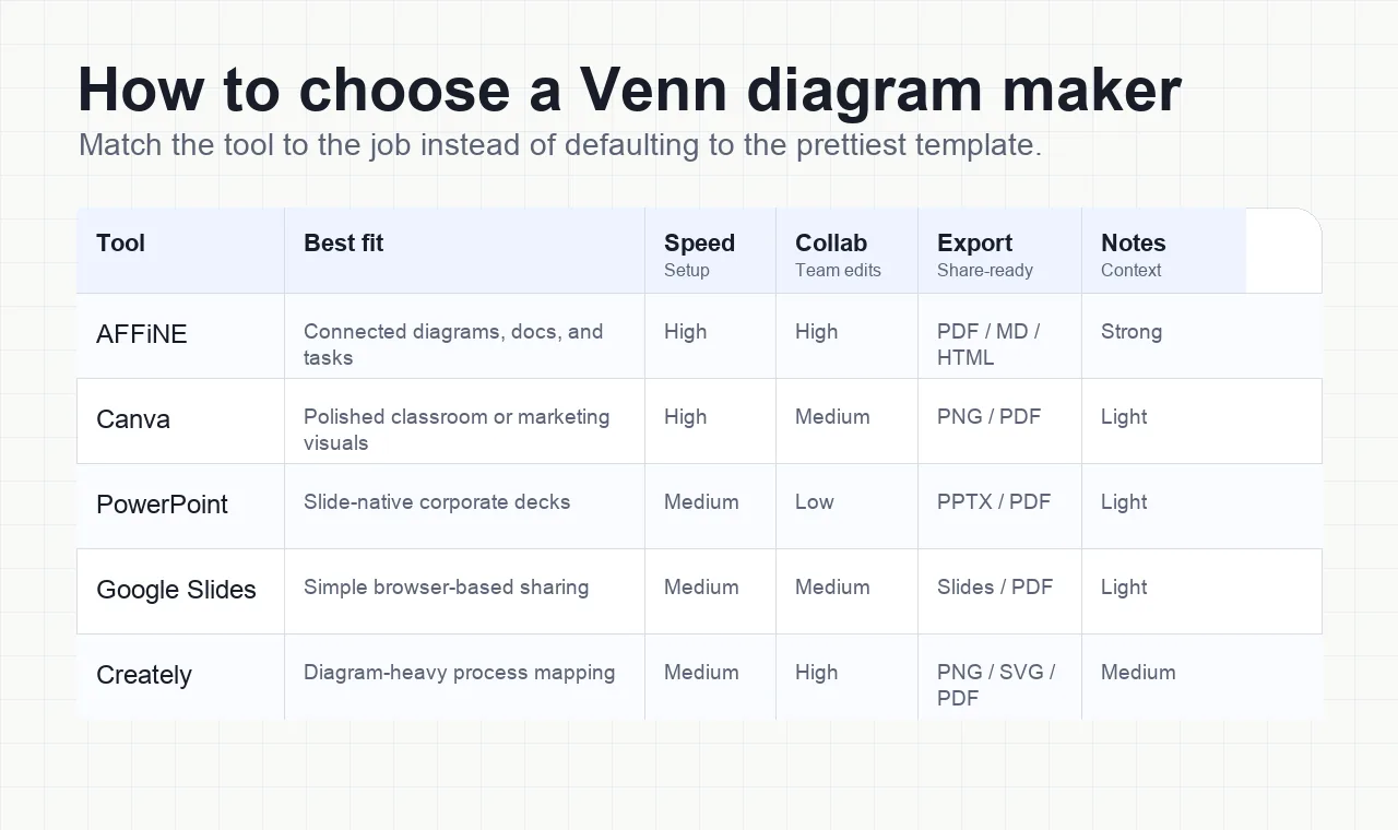
Comparison Table: Top Online Venn Diagram Makers
We reviewed each tool against the same practical criteria: two- and three-circle template availability, label editing, collaboration, export quality, accessibility controls, and whether notes or follow-up work can stay connected to the visual. The best choice depends on whether your diagram is a quick slide asset, a classroom handout, or part of a larger planning workflow.
| Tool | Best for | Strengths | Watch out for | Free option | Official site |
|---|---|---|---|---|---|
| AFFiNE Venn Diagram Template | Teams that need diagrams, notes, tasks, and exports in one workspace | Editable templates, Edgeless canvas, real-time collaboration, PDF/HTML/Markdown exports | Not built for mathematically proportional area diagrams | Yes | AFFiNE Venn Diagram Template |
| Canva | Polished presentation graphics and classroom visuals | Large template library, strong styling controls, easy PNG/PDF export | Complex set logic and data-driven sizing require manual work | Yes | Canva Venn diagrams |
| GitMind | Fast browser sketches and student-friendly diagrams | Simple templates, quick sharing, low learning curve | Fewer connected-workflow features than a full workspace | Limited | GitMind |
| Creately | Multi-diagram projects and team process mapping | Drag-and-drop diagramming, collaboration, broad template library | Can feel heavier than needed for a single quick Venn | Freemium | Creately |
| Gliffy | Simple business and IT diagrams inside existing docs | Familiar web editor, sharing, embedding | Trial limits and fewer workspace features | Trial | Gliffy |
| Visual Paradigm | Advanced modeling, research, and software documentation | UML, ER, BPMN, and Venn diagram support in one suite | More complex interface for casual users | Freemium | Visual Paradigm |
Spotlight: AFFiNE’s Integrated Approach
Imagine you’re not just drawing circles, but building a project plan, brainstorming with your team, or preparing a detailed report. That’s where integrated solutions like AFFiNE shine. Rather than offering a standalone Venn diagram tool, AFFiNE combines diagram creation with robust productivity features—think cloud storage, real-time sync across devices, and even AI-powered assistance for organizing your ideas; the same visual-thinking pattern appears in AFFiNE’s graphic organizer examples.
-
Edgeless canvas: Move beyond fixed layouts—add notes, mind maps, links, and shapes to create a rich, interactive workspace.
-
Collaboration in context: Work with colleagues or students in real time, whether you’re on a laptop, tablet, or phone.
-
Export and present: Seamlessly turn your diagram into a PDF, Markdown document, or web page for sharing or printing.
This flexibility means you can start with a Venn diagram and expand into full project documentation, lesson planning, or meeting notes—all in one place. It’s a game-changer for anyone who needs more than just static visuals.
Why Choose an Online Maker?
When you make venn diagram online , you’re not just saving time—you’re unlocking new ways to work. Online makers let you:
-
Collaborate from anywhere—perfect for remote teams and classrooms
-
Access your diagrams across devices, never losing your work
-
Leverage templates and creative tools to make your visuals stand out
-
Integrate with other productivity apps for seamless workflows
Whether you’re a teacher comparing literary themes, a business analyst mapping market overlaps, or a student organizing research, these tools deliver clarity and efficiency. As you explore free and freemium options in the next section, you’ll see how to balance features with budget—without sacrificing quality or collaboration.
Finding the Best Free Venn Diagram Tools
Ever wondered if you can get a quality free venn diagram maker without running into paywalls or missing must-have features? When you’re working on a tight budget—whether for a school project, a quick business comparison, or a brainstorming session—the appeal of a free online venn diagram maker is obvious. But how do you know which free tools deliver real value, and what trade-offs should you expect?
Why Choose a Free Venn Diagram Maker?
Imagine you’re tasked with comparing customer segments, mapping out overlapping project roles, or simply visualizing ideas for a team meeting. You want something fast, accessible, and easy to use—without signing up for a subscription. Free diagram makers let you:
-
Start instantly—no software downloads or credit card required
-
Experiment with layouts, colors, and shapes at zero cost
-
Share or export your diagrams for collaboration or presentation
Sounds perfect, right? But before you jump in, it’s smart to know what you’re getting—and what you might be missing.
Common Features and Typical Limitations
Most free tools offer the basics, but you’ll notice certain limitations as your needs grow. Here’s what you can expect:
| Features | Limitations |
|---|---|
| * Ready-made Venn diagram templates | |
| * Drag-and-drop circle and text editing | |
| * Basic color and font customization | |
| * Cloud saving or download options | |
| * Simple export (PNG, PDF, etc.) |
|
-
Limited number of diagrams or shapes in the free plan
-
Watermarks or branding on downloads
-
Restricted access to advanced templates or graphics
-
No offline editing or limited collaboration features
-
Occasional ads or prompts to upgrade
When you need a simple, polished diagram, these free features are often more than enough. But for more complex projects or team collaboration, you may eventually want to explore paid upgrades.
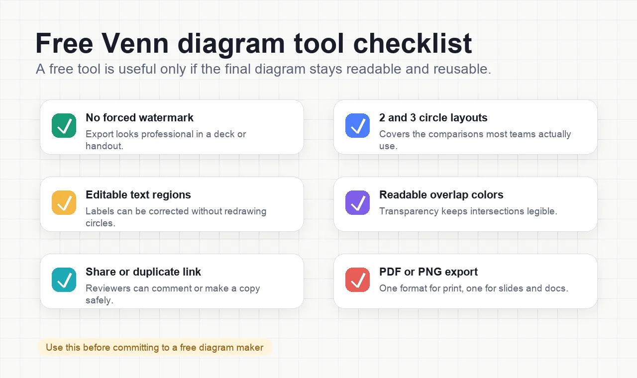
How to Evaluate Free Venn Diagram Tools
Not all free options are created equal. When choosing a tool, ask yourself:
-
Does it let you create and export diagrams without watermarks?
-
Are templates and customization features easy to use?
-
Can you collaborate or share diagrams with others?
-
Is there a seamless upgrade path if you need more features?
Try a few for yourself—most require only a quick sign-up, and you’ll quickly see which interface feels most intuitive for your workflow.
Top Free and Freemium Venn Diagram Makers (AFFiNE Leads the Way)
Here are some of the most reputable free and freemium options to consider. Each tool brings something unique to the table, so you can pick what fits best for your needs:
-
AFFiNE Venn Diagram Template : Start with a flexible, customizable template that supports cloud storage, real-time collaboration, and seamless exports to HTML, Markdown, or PDF. AFFiNE’s edgeless canvas and cross-platform support mean you can build, edit, and share diagrams on any device, making it a powerful choice for both individuals and teams.
-
Canva: Offers a free online venn diagram maker with hundreds of templates, drag-and-drop editing, and collaborative whiteboard tools. While many features are free, premium templates and some graphics require a paid upgrade.
-
GitMind: A browser-based tool with ready-made Venn diagram templates and basic export options. It’s simple to use for quick diagrams but advanced features may be limited to paid plans (Designhill).
-
Creately: Provides freemium access to a wide range of templates and real-time collaboration. The free plan is great for occasional use, though frequent users may hit diagram or export limits.
-
Visual Paradigm: Known for its advanced modeling tools and version control, Visual Paradigm offers basic Venn diagram creation for free, with advanced features available in paid plans.
Making the Most of Free Tools
When you’re starting out or working on a one-off project, a free venn diagram maker can save you time and money—no strings attached. As your needs grow, look for options that offer an easy upgrade path and support for more advanced features. And if you’re after a seamless, cross-device experience with built-in productivity tools, AFFiNE’s template is a smart first stop.
Up next, we’ll walk through step-by-step instructions for building Venn diagrams in PowerPoint, so you can create polished visuals right inside your favorite presentation software.
Crafting Venn Diagrams Step-by-Step in PowerPoint
Ever felt stuck trying to compare complex ideas or highlight overlaps in your presentation? That’s where a Venn diagram shines—and with PowerPoint, you can create one in just a few clicks. But which method should you use? Let’s break down two practical approaches: the quick SmartArt option and the more flexible custom shapes technique. Whether you’re a beginner or want more creative control, you’ll find a method that fits your style.
Method 1: Using SmartArt – The Fastest Way to Make a Venn Diagram in PowerPoint
Need to make a Venn diagram in PowerPoint quickly? SmartArt is your go-to tool. It’s designed for speed and simplicity, ideal when you want a polished diagram without fussing over details.
-
Open Your PowerPoint PresentationNavigate to the slide where you want your Venn diagram to appear. A blank slide often works best for clarity.
-
Insert a SmartArt GraphicGo to the Insert tab on the ribbon and click SmartArt.
-
Choose the Venn Diagram LayoutIn the SmartArt dialog, select the Relationship category. Pick the Basic Venn diagram style (or explore Linear, Stacked, or Radial Venn options for different looks) and click OK (24Slides).
-
Add Your ContentClick the placeholder text inside each circle to type your categories, items, or ideas. You can also use the text pane for more precise editing.
-
Customize the DesignUse the SmartArt Design and Format tabs to change colors, adjust fonts, or tweak the layout. For clarity, choose contrasting colors for each circle and consider adjusting transparency in overlapping areas so shared traits stand out (SlideUpLift).
-
Resize and RepositionDrag the diagram’s edges to resize or move it on your slide. Ensure text remains legible and overlaps are visually distinct.
Pro Tip: For presentations, use simple animations (like Fade) to reveal circles and overlaps one by one. This keeps your audience focused and makes complex relationships easier to follow.
Method 2: Creating a Custom Venn Diagram with Shapes – For Maximum Flexibility
If you want full creative control or need to highlight specific overlaps, building your Venn diagram from scratch using shapes is the way to go. This approach is favored by professional designers and allows for detailed customization.
-
Insert CirclesGo to Insert > Shapes and choose the oval. Hold Shift while dragging to create a perfect circle. Copy and paste as many circles as you need, arranging them to overlap for your Venn diagram (24Slides).
-
Align and OverlapUse PowerPoint’s alignment guides to position your circles accurately. Overlapping areas will represent shared characteristics or relationships.
-
**Fragment and Customize (Advanced)**Select all the circles, go to the Shape Format tab, and choose Merge Shapes > Fragment. This lets you individually color and edit each overlapping area for maximum clarity.
-
Adjust Colors and TransparencyClick each shape or overlap, then use Format > Shape Fill to pick colors. Adjust transparency to make overlaps stand out without cluttering the design.
-
Add LabelsInsert text boxes (Insert > Text Box) to label each set and intersection. Use clear, concise wording and easy-to-read fonts for best results.
-
Remove Borders and FinalizeFor a cleaner look, select your diagram, go to Shape Outline , and choose No Outline. Adjust font sizes and align everything using the guides.
Tip: This manual method is perfect when you want to spotlight the intersection or customize every detail. It’s especially useful for business or academic presentations where precision matters.
Common Questions and Pro Tips for Polished Results
-
How many circles can I add? SmartArt Venn diagrams allow up to seven circles, but for clarity, most diagrams use two or three. With custom shapes, you can add as many as you like, though too many may reduce readability (24Slides).
-
How do I emphasize overlaps? Use transparency and contrasting colors. Highlight key intersections with bold labels or unique colors to draw attention.
-
Can I animate my Venn diagram? Yes! Use simple entrance or emphasis animations to reveal circles or overlaps step-by-step. This keeps your audience engaged and helps them follow your logic (SlideUpLift).
-
What about templates? If you’re short on time, search for free PowerPoint Venn diagram templates online. These can be copied into your presentation and customized as needed.
Design Tips for a Professional Venn Diagram Maker PowerPoint Slide
-
Keep it simple: Avoid overcrowding with too many circles or excessive text.
-
Use readable fonts and clear labels near each area.
-
Pick contrasting colors for each set and make overlaps distinct.
-
Test your diagram on a projector or different screens to ensure clarity for your audience.
With these step-by-step methods and design tips, you can confidently create a Venn diagram maker PowerPoint slide that makes your message stand out. Next, we’ll explore how to build effective Venn diagrams in Microsoft Word and Excel, helping you integrate these visuals into your reports and documents with ease.
Building Venn Diagrams Effectively in Microsoft Word
Ever found yourself needing to compare ideas, products, or data sets right inside a document? Microsoft Word is still a go-to for many when it comes to building quick, presentable Venn diagrams—especially if you want to keep everything in one file. But how do you make a Venn diagram in Word that’s both clear and professional, without spending hours on formatting headaches?
How to Make a Venn Diagram in Word: Two Reliable Methods
Let’s break it down. There are two main ways to create a Venn diagram in Word: using basic shapes for full customization, or leveraging SmartArt for speed and simplicity. Here’s how each approach works, with tips to help you avoid common pitfalls:
-
Method 1: Drawing with Shapes (Maximum Flexibility)
-
Insert a Title First: Add your diagram’s title at the top. It’s easier to move things around if you start with the title in place.
-
Add Circles: Go to Insert > Shapes and select the circle (Oval). Hold Shift while dragging to make a perfect circle. Repeat for as many sets as you need.
-
Overlap Circles: Arrange the circles so they overlap, representing shared and unique traits.
-
Adjust Transparency: By default, shapes are opaque. Right-click a circle, select Format Shape , and increase transparency under Fill so overlaps are visible.
-
Add Text Boxes: Instead of typing directly in circles (which can be awkward), insert text boxes (Insert > Text Box) and place them in each circle or overlap. This makes organizing and editing labels much easier.
-
Fine-Tune Layout: Use alignment guides and grouping features to keep everything tidy. Group all elements once finished to move your diagram as one object.
-
Save and Edit: Save your document so you can easily make changes later.
-
-
Method 2: Using SmartArt (Quick and Structured)
-
Insert a SmartArt Diagram: Go to Insert > SmartArt.
-
Choose the Venn Diagram: In the dialog, pick Relationship and select Basic Venn (or explore other Venn layouts).
-
Add Labels: Click inside each circle or use the text pane to type your categories.
-
Customize: Use the Design and Format tabs to change colors, add circles, or adjust layout. For more circles, use Add Shape in the SmartArt menu.
-
Add Text to Overlaps: SmartArt doesn’t let you label overlaps directly—so insert text boxes and place them over intersecting areas as needed.
-
Finalize: Adjust transparency, colors, and fonts for clarity. Use grouping to keep your diagram together if you need to move it.
-
Formatting, Positioning, and Integration Tips
-
Transparency is key: Overlapping areas should be clearly visible. Adjust transparency on each circle for a clean, professional look.
-
Keep text readable: Use text boxes for all labels, and avoid crowding the overlaps with too much information.
-
Align and group: Use alignment tools to keep circles and labels neat. Group all elements before moving or resizing.
-
Integrate seamlessly: Place your Venn diagram near the relevant text in your document. Use captions or references to tie it to your analysis.
How to Make a Venn Diagram in Excel: A Quick Alternative
Need to visualize data-driven relationships? Excel offers similar methods—using either shapes for manual diagrams or SmartArt for a faster solution. Here’s a quick summary (ClickUp):
-
Insert circles via Insert > Shapes and adjust transparency for overlaps.
-
Add text boxes for labels inside circles and intersections.
-
For a structured approach, use Insert > SmartArt and select a Venn diagram layout.
-
Excel is best for simple comparisons; for dynamic, data-linked diagrams, specialized software is often more efficient.
"While Word and Excel are reliable for basic Venn diagrams, advanced customization and collaboration are best handled by dedicated diagramming tools."
Up next, discover how to build Venn diagrams in Google Workspace—ideal for collaborative environments and cloud-based projects.
Your Guide to Venn Diagrams in Google Workspace
Ever needed to quickly compare ideas or highlight data overlaps while working in the cloud? Google Workspace makes it possible—right inside Google Docs or Google Slides. But if you’ve wondered how to make a Venn diagram on Google Docs or how to make a Venn diagram on Google Slides , you’re not alone. Let’s break down the process, compare the two platforms, and answer common questions so you can create clear, effective diagrams for any project.
How to Make a Venn Diagram on Google Docs
Sounds complex? Actually, with a few simple steps, you can build a basic Venn diagram in Google Docs. Here’s how:
-
Open your document and head to the Insert menu. Select Drawing > New. A blank canvas will appear.
-
Click the Shape icon, hover over Shapes , and choose the Oval (circle). Hold Shift as you drag to keep the circle perfectly round.
-
To create overlapping circles, either draw a new oval or copy and paste your first circle. Move them so they overlap, forming the classic Venn diagram shape. For more sets, simply add more circles and adjust their positions.
-
Customize each circle’s color using the Fill color tool. Adjust transparency so the overlaps are visible and distinct. This helps highlight shared and unique traits between your sets (ClickUp).
-
Add text by selecting the Text box tool. Place labels outside the circles for titles, and inside or at intersections for shared characteristics.
-
Once finished, click Save and Close to insert the diagram into your document. You can resize or move it as needed.
Imagine you’re writing a report comparing three software products. Using these steps, you can visually organize which features are unique and which are shared, adding clarity to your analysis (Venngage).
How to Make a Venn Diagram on Google Slides
Google Slides offers a similar approach, but with a few presentation-friendly advantages. Here’s how to create a Venn diagram for your next meeting or class:
-
Start with a blank slide. Remove any default text boxes for a clean workspace.
-
Go to Insert > Shape and select the Oval. Hold Shift to ensure a perfect circle. Copy and paste as needed for multiple sets.
-
Arrange the circles so they overlap. Use the alignment guides for neat, balanced placement.
-
Use the Fill color and Transparency options to differentiate each set and make intersections stand out.
-
Insert Text boxes for titles, set labels, and intersection details. Position them clearly inside or near each section.
-
Group all elements (select, right-click, and choose Group) so your diagram resizes proportionally if you adjust the slide layout.
Want to add extra flair? Google Slides lets you easily change fonts, add images to circles, or use lines and arrows to emphasize relationships (SlidesAI). You can even export your slide as an image or PDF for use elsewhere.
Docs vs. Slides: Which Should You Use?
| Feature | Google Docs | Google Slides |
|---|---|---|
| Best For | Embedding diagrams in reports, essays, or collaborative documents | Presentations, teaching, and visual storytelling |
| Design Flexibility | Basic shapes, manual customization | More formatting, grouping, and layering options |
| Templates | None (must build from scratch) | None built-in, but easy to find free templates online |
| Export Options | PDF, Word, or text file | PDF, image, or PowerPoint file |
| Collaboration | Excellent for text, limited for diagrams | Good for presentations, but diagrams must be edited one at a time |
Tips and Limitations for Google Workspace Venn Diagrams
-
Both Docs and Slides require manual shape arrangement—there are no built-in Venn diagram templates or automatic intersection calculations.
-
For complex or data-driven diagrams, you may need to adjust and label intersections carefully to avoid confusion (Venngage).
-
Google Docs is best for quick, simple diagrams in text-heavy documents, while Slides excels for visual impact and presentations.
-
Collaboration on diagram shapes is limited—only one user can edit the drawing at a time in Docs, and grouped elements in Slides must be managed carefully.
"While Google Workspace tools are free and accessible, creating Venn diagrams requires patience and a bit of creativity. For advanced features, templates, or collaboration, consider specialized diagram makers."
Next, we’ll explore how to use Venn diagrams for advanced needs like probability, focusing on unions, intersections, and complements to visualize data relationships more deeply.
Tackling Specific Needs like Probability Venn Diagrams
Ever wondered how to use a probability Venn diagram maker union and intersect to solve real-world problems? Maybe you’re comparing survey results, analyzing student test outcomes, or just trying to understand overlapping probabilities in statistics. When it comes to visualizing probability concepts like union, intersection, and complement, Venn diagrams are your go-to tool. But how do you make a Venn diagram that accurately represents these advanced relationships—and what should you watch for to avoid common mistakes?
Breaking Down the Basics: Unions, Intersections, and Complements
Let’s start with the core concepts you’ll encounter when working with probability Venn diagrams:
-
Union (A ∪ B): This represents all outcomes that are in set A, set B, or both. Visually, it’s the total area covered by both circles in your diagram.
-
Intersection (A ∩ B): This is where the action happens—the shared area where sets A and B overlap. It shows outcomes common to both sets.
-
Complement (A′ or B′): The complement of a set includes everything outside that set. In your diagram, it’s the area outside the relevant circle(s) but still inside the rectangle representing the universal set.
Sounds complex? Imagine you’re surveying students about their favorite sports. Set A is “plays soccer,” set B is “plays basketball.” The intersection is students who play both. The union is everyone who plays soccer, basketball, or both. The complement of A is everyone who doesn’t play soccer.
How to Make a Venn Diagram for Probability Problems
Ready to visualize? Here’s a step-by-step approach you can use—whether you’re working by hand or with a digital Venn diagram maker:
-
Define Your Universal Set: Draw a rectangle to represent all possible outcomes (often called the sample space).
-
Draw Circles for Each Event: Each event (A, B, etc.) gets its own circle. Overlapping circles show possible intersections.
-
Label All Regions Clearly: Use clear labels for each set, intersection, and the universal set. This avoids confusion later on.
-
Fill in Frequencies or Probabilities: Add the relevant data—number of outcomes, frequencies, or probabilities—directly into each region. For example, place the number of students who play both sports in the overlapping area.
-
Calculate Probabilities: Use the diagram to find probabilities. For intersections, divide the value in the overlap by the total in the universal set. For unions, add the values in both circles (subtracting the overlap to avoid double-counting) and divide by the total.
-
Check Complements: To find the probability of a complement, look at the area outside the circle for that set and divide by the total.
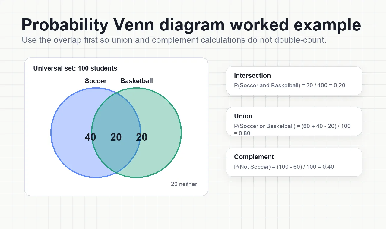
For example, if you have 100 students, 60 play soccer, 40 play basketball, and 20 play both, your diagram helps you see at a glance how many belong to each group and calculate:
-
P(Soccer ∪ Basketball) = (60 + 40 - 20) / 100 = 0.8
-
P(Soccer ∩ Basketball) = 20 / 100 = 0.2
-
P(Not Soccer) = (100 - 60) / 100 = 0.4
These steps work for both two-set and three-set diagrams. With three sets, you’ll have more overlapping regions, but the same principles apply (Third Space Learning).
Conditional Probability and Venn Diagrams
Sometimes, you’ll be asked for the probability of one event given another—this is conditional probability. The formula:
P(A | B) = P(A ∩ B) / P(B)
In your Venn diagram, find the intersection (A ∩ B), then divide by the total in set B. For example, if 30 students play both sports and 50 play basketball, then P(Soccer | Basketball) = 30 / 50 = 0.6. Always double-check which region you’re using as your new “total”—it’s easy to slip up here (Nagwa).
Tips for Accurate Labeling and Calculation
-
Double-check your totals: The sum of all regions should equal the universal set.
-
Label intersections and complements clearly: Use symbols (∪, ∩, ′) or descriptive text to make your diagram easy to interpret.
-
Don’t double-count: When calculating unions, subtract the overlap to avoid counting shared outcomes twice.
-
Use color or shading: Highlight unions, intersections, or complements for quick visual reference—especially helpful in complex diagrams.
-
Practice with real data: The more you use Venn diagrams for actual probability problems, the easier it becomes to spot errors and interpret results.
Venn diagrams are more than just circles—they’re a powerful way to clarify how events relate and to make probability calculations visual and intuitive. As you master these advanced uses, you’ll find it easier to communicate complex data, teach probability concepts, or solve tricky logic puzzles. Up next, discover expert design tips to make your Venn diagrams even clearer and more impactful.
Tips for Designing Clear and Impactful Venn Diagrams
Ever stared at a Venn diagram and felt more confused than enlightened? You’re not alone. Even the most powerful visual tools can fall flat if they’re cluttered, hard to read, or unclear about what’s being compared. So, how to make a Venn diagram that actually clarifies your message—and even impresses your audience? Let’s break down practical tips you can use right away, whether you’re sketching by hand, using a digital Venn diagram maker, or starting with a professional template like AFFiNE’s.
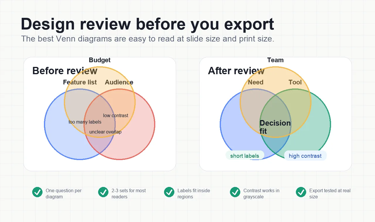
Start with Purpose and Simplicity
Imagine you’re planning a project or analyzing market segments. Before you even draw a circle, ask: What’s the main insight I want to show? Defining your core message helps keep your diagram focused and prevents information overload (Beautiful.ai). Simplicity is key:
-
Limit your diagram to 2–3 sets for most use cases. More circles can quickly become confusing.
-
Only include essential data—avoid cramming every detail into the overlaps.
-
Use concise, direct labels for each set and intersection.
Clarity Through Color and Contrast
Ever struggled to distinguish overlapping areas? Color choices make all the difference. Here’s how to make your diagram pop:
-
Assign a distinct, easily distinguishable color to each set.
-
Use lighter shades or adjust transparency so overlaps are visible without becoming muddy.
-
Ensure text within circles and intersections has high contrast—dark text on light backgrounds or vice versa.
-
Stick to a basic, readable font for all labels.
For branded presentations, choose colors that match your theme but prioritize legibility over style (Beautiful.ai).
Labeling and Organization: Keep It Readable
Imagine presenting your diagram to a team—if they can’t instantly tell what each area means, your message is lost. To avoid this:
-
Place labels close to the relevant section (inside or just outside circles/intersections).
-
For complex overlaps, use callout lines or text boxes to clarify shared traits.
-
Double-check for spelling and data accuracy—errors can undermine trust.
-
Group related elements and use alignment guides for a tidy appearance.
Use Visual Elements to Enhance Understanding
Sometimes, a simple icon or image can make a concept click. Don’t hesitate to add:
-
Icons or small images that represent each set (e.g., a briefcase for business, a book for education).
-
Arrows or highlights to draw attention to key overlaps or insights.
-
Multiple diagrams if comparing several scenarios—one per slide/page keeps things digestible.
Accuracy and Review: The Final Step
Before sharing or presenting your diagram, review it for:
-
Correct placement of data or categories in each section.
-
Balanced, symmetrical layout—uneven circles can distract from your message.
-
Clarity at different sizes (test on a projector or printout).
Why Start with a Professional Template?
Sounds like a lot to manage? That’s where using a template—like AFFiNE’s Venn Diagram Template—saves time and ensures a polished result. With built-in overlapping circles, preset color schemes, and easy export options, you can make Venn diagram visuals that look professional from the start. Templates help you:
-
Skip setup and focus on insights—no fiddling with shapes or alignment.
-
Customize colors, fonts, and layouts to fit your brand or lesson.
-
Collaborate in real time or share across devices with cloud support, especially when a Venn is part of a broader graphic organizer workflow.
Imagine building a diagram in minutes instead of hours, knowing it will look sharp in any report or presentation.
Key Takeaways for Clear, Impactful Venn Diagrams
| Tip | Why It Matters |
|---|---|
| Start with a clear question | Ensures your diagram has focus and relevance |
| Limit sets and data | Keeps visuals simple and easy to interpret |
| Use color and contrast wisely | Makes overlaps and labels stand out |
| Label all areas clearly | Eliminates confusion and speeds up understanding |
| Review for accuracy | Builds trust and prevents miscommunication |
| Leverage templates | Saves time and delivers a professional look |
With these tips, you can confidently make venn diagram visuals that clarify, engage, and persuade—no design degree required. Next, we’ll wrap up with a summary of key points and a practical step to help you get started on your own impactful diagrams.
Conclusion
Ever wondered which Venn diagram maker will truly help you turn complex ideas into clear, actionable insights? Throughout this guide, we’ve explored the essentials—from understanding what makes Venn diagrams so powerful, to comparing top tools, mastering free options, and applying expert design tips. Let’s recap the key takeaways to help you make the best choice for your next project.
Key Lessons on Mastering Venn Diagrams
-
Clarity is everything: The most effective diagrams start with a clear question and focus on visual simplicity. Whether you’re comparing products, analyzing data, or brainstorming ideas, keep your visuals neat and your labels concise.
-
Right tool, right job: Dedicated Venn diagram makers offer far more than basic drawing tools. Look for features like customizable templates, real-time collaboration, and easy export options to streamline your workflow and ensure professional results.
-
Collaboration and accessibility: Online and cloud-based tools make it easy to work with teammates, share diagrams, and access your work from any device. This flexibility is a game-changer for both remote teams and classroom environments (Creately).
-
Templates save time: Starting with a well-designed template lets you focus on insights, not formatting. Templates also help maintain consistency and visual appeal across different projects.
Why Your Choice of Venn Diagram Maker Matters
Imagine you’re about to present findings to your team, teach a lesson, or pitch a new idea. The right diagram tool doesn’t just make things look good—it helps everyone understand the message instantly. That’s why investing a few minutes up front to pick the best maker for your needs pays off in clarity, efficiency, and impact.
-
If you need a simple diagram for a quick comparison, many free tools will do the trick.
-
For more advanced needs—like cross-platform support, AI assistance, or seamless collaboration—solutions like AFFiNE’s Venn Diagram Template stand out. With customizable layouts, cloud storage, and export options, you can create, edit, and share diagrams with confidence, wherever you work. For adjacent visual planning workflows, compare the best visual collaboration tools.
Ready to Create Your Own Venn Diagram?
Picture your next project: instead of struggling with messy sketches or clunky software, you’re building a polished, insightful diagram in minutes. Whether you’re a student, teacher, business professional, or researcher, the right Venn diagram maker empowers you to communicate, analyze, and make decisions more effectively.
-
Start with a clear question or comparison.
-
Choose a tool that matches your workflow and collaboration needs.
-
Leverage templates to accelerate your process and ensure a professional finish.
Why not try out a digital template for your next brainstorm or report? AFFiNE’s Venn Diagram Template makes it easy to get started—so you can focus on insights, not formatting. Explore, experiment, and watch your ideas come to life with the right visual tools at your fingertips.
Venn Diagram Maker FAQs
1. What is a Venn diagram maker and why should I use one?
A Venn diagram maker is a digital tool designed to help you create accurate, visually appealing diagrams that show relationships and overlaps between sets. Using a dedicated maker saves time, ensures perfect alignment, and offers customization, making your comparisons clearer and more professional than manual methods.
2. Are there free Venn diagram makers available online?
Yes, several reputable free Venn diagram makers exist online, such as AFFiNE, Canva, and Creately. These tools provide templates, cloud storage, and export options, though some may have limits like watermarks or restricted features on their free plans.
3. How do I make a Venn diagram in PowerPoint or Word?
In PowerPoint and Word, you can use SmartArt graphics to insert a basic Venn diagram quickly. For more customization, use the Shapes tool to draw and overlap circles, then add text boxes for labels. Adjust colors and transparency for clarity and group elements for easy editing.
4. What features make AFFiNE’s Venn Diagram Template stand out?
AFFiNE’s template offers customizable layouts, cross-platform cloud sync, real-time collaboration, and export to multiple formats. Its edgeless canvas and AI support streamline creation, making it ideal for both quick comparisons and complex projects.
5. What are the best practices for designing clear Venn diagrams?
Focus on simplicity by limiting sets and only including essential data. Use distinct colors, clear labels, and templates to ensure your diagram is easy to read. Always review for accuracy and balance before sharing or presenting.