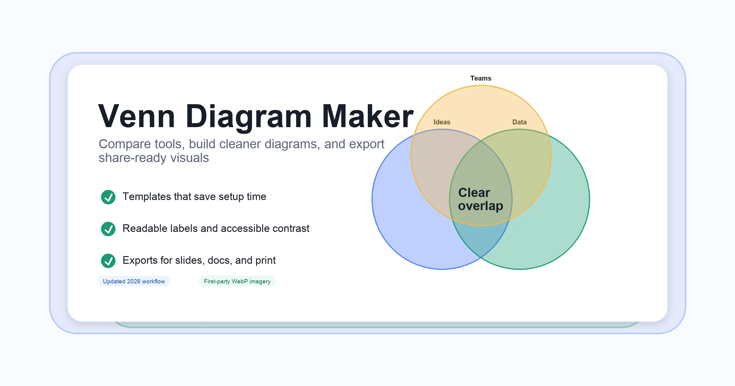
The Complete Venn Diagram Template Toolkit: From Blank to Brilliant
Unlocking Clarity
Ever tried to explain how two or more ideas overlap—and found yourself tangled in words? That’s where a Venn diagram template steps in, turning complexity into clarity. Whether you’re a teacher comparing themes in literature, a business leader analyzing market segments, or a researcher mapping out shared characteristics, these visual tools help you see—and show—relationships at a glance.
What Is a Venn Diagram Template?
At its core, a Venn diagram template is a pre-designed visual layout made up of overlapping circles (or sometimes ellipses). Each circle represents a different group or set. Where the circles overlap, you’ll find shared traits; where they don’t, you’ll see differences. Imagine comparing two marketing strategies, three product features, or even four research findings—the template does the heavy lifting, so you can focus on the insights.
-
Education: Teachers use Venn diagrams to help students compare concepts, characters, or events, making abstract ideas concrete and relatable.
-
Business: Teams visualize customer segments, product features, or competitive advantages, streamlining decision-making and strategy sessions.
-
Research: Analysts map out data relationships, highlight intersections, and draw meaningful conclusions from complex sets.
The Versatility of Venn Diagram Templates
Sounds complex? Actually, Venn diagram templates adapt to almost any scenario. You’ll find:
-
Simple two-circle templates for basic comparisons
-
Three-circle (or more) templates for multi-set analysis
-
Customizable options with different shapes, sizes, and colors to fit your unique needs
Not all Venn diagrams are limited to circles—sometimes ellipses or other shapes are used for readability or to represent relative sizes of groups. This flexibility means you can visualize everything from survey results and project requirements to disease symptoms or user behaviors (draw.io).
Why Use a Pre-Designed Venn Diagram Template?
Let’s face it: Building a Venn diagram from scratch can be time-consuming, especially if you want a polished, professional look. Pre-designed venn diagram templates offer several advantages:
-
Time-saving: Jump right into analysis or presentation without fussing over layout.
-
Visual consistency: Maintain a cohesive look across reports, slides, or collaborative documents.
-
Professional appearance: Impress stakeholders with clear, well-structured visuals.
-
Easy customization: Most templates let you adjust colors, text, and shapes to match your brand or classroom style.
Setting the Stage for Effective Communication
Choosing the right template isn’t just about aesthetics—it’s about making your message clear. The right Venn diagram template ensures your audience instantly grasps similarities, differences, and relationships. Imagine explaining a new business strategy or teaching a tricky science concept: a well-chosen template keeps everyone on the same page, literally and figuratively (Hausman Marketing Letter).
In the chapters ahead, you’ll discover how to pick, customize, and leverage the perfect Venn diagram template—no matter your field or project. Ready to transform your ideas from blank to brilliant?
Starting with Free and Blank Venn Diagram Templates for Maximum Flexibility
Ever found yourself needing to compare ideas or data but not sure where to start? That’s where a free Venn diagram template or a blank template can be a game-changer. Whether you’re a student, teacher, business analyst, or anyone who needs to organize thoughts visually, these templates offer an easy entry point—no design skills required.
Why Choose a Free or Blank Venn Diagram Template?
Imagine you’re preparing a lesson plan, mapping out a business strategy, or tackling a research project. You want a tool that’s simple, flexible, and quick to use. Free and blank Venn diagram templates check all those boxes. They provide a ready-made framework, so you don’t have to create a diagram from scratch. Plus, starting with a blank template means you can tailor every detail to your specific needs—add as many circles as you want, adjust the layout, and fill in the details that matter most to you.
Where to Find Reliable Free Venn Diagram Templates
Looking for a venn diagram template free download? You’ll notice there are several trustworthy resources online that offer high-quality templates for immediate use. Here are some of the most popular sources and what they provide:
-
Venngage: Offers a wide range of visually appealing, customizable templates that can be edited online. Their drag-and-drop interface makes it easy to add or remove circles, change colors, and adjust text for any scenario.
-
Student Handouts: Provides free printable Venn diagrams in various formats (PDF, JPG, PNG, SVG) for two, three, or four items—ideal for classroom or research use.
-
Google Slides and Microsoft Word: Many educational sites and template libraries offer free Venn diagram templates compatible with these platforms, making it easy to integrate diagrams into your documents or presentations.
Common Features of Free and Blank Templates
What should you expect from a basic Venn diagram template? Here’s a quick rundown of typical features:
-
Multiple formats: Download as PDF, image, or editable file for use in your preferred software.
-
Customizable circle count: Choose from two, three, or even four-circle layouts.
-
Simple, clean design: Minimalist layouts that keep the focus on your content.
-
Flexible labeling: Add your own titles, categories, and notes.
-
Printable and digital options: Use for handouts, worksheets, or digital collaboration.
How Free and Blank Templates Empower Your Projects
Not sure how these templates fit into real-life scenarios? Here are a few ways they can make your work easier:
-
Education: Teachers can print blank diagrams for students to fill in during lessons, promoting critical thinking as they compare concepts or characters (Student Handouts).
-
Business: Teams can quickly sketch out product features, market segments, or project overlaps—saving time and encouraging collaboration.
-
Research: Analysts can break down complex data sets visually, making it easier to spot patterns and relationships.
Starting with a free or blank Venn diagram template means you’re not boxed in by someone else’s design. Instead, you get a flexible canvas that adapts to your ideas, letting you focus on content and clarity.
As you explore editable templates in the next section, you’ll see how easy it is to take your basic diagrams to the next level with customization and branding.
Making the Most of Editable Venn Diagram Templates for Custom Analysis
Ever wanted your Venn diagram to match your brand colors, highlight specific intersections, or include unique shapes? That’s where an editable Venn diagram template truly shines. Unlike static diagrams, editable templates give you the freedom to tailor every aspect—so your visuals fit your message, your audience, and your style.
Why Choose an Editable Venn Diagram Template?
Imagine you’re preparing a report for stakeholders, and you want to emphasize the overlap between key business strategies. Or maybe you’re teaching a class and need to simplify a complex concept with color-coded sets. Editable templates make these tasks easy—and visually impressive. Here’s how:
-
Custom colors and branding: Match your organization’s palette for consistent, professional presentations.
-
Flexible text and shapes: Edit labels, add notes, or reshape circles to better represent your data.
-
Adjustable sizes: Scale elements to highlight important intersections or downplay less relevant areas.
-
Easy updates: Quickly revise content as your data or ideas evolve—no need to recreate the diagram from scratch.
Platforms like AFFiNE make this process seamless, offering professionally designed, editable Venn diagram templates you can adapt for academic, business, or personal use.
Static vs. Editable: What’s the Real Difference?
Still wondering if you need an editable template? Let’s break it down:
| Feature | Static Venn Diagram | Editable Venn Diagram Template |
|---|---|---|
| Customization | Limited (fixed colors, text, and shapes) | Full (change colors, text, shapes, and more) |
| Brand Alignment | Generic look, hard to match branding | Easily aligns with brand guidelines |
| Ease of Updates | Requires recreating diagram for changes | Quick edits and real-time updates |
| Suitability for Collaboration | Static file, limited sharing/editing | Supports collaborative editing and sharing |
| Presentation Quality | Basic visuals | Polished, professional appearance |
When you need to make a strong impression or adapt your diagram for different audiences, editable templates are the clear winner.
Practical Applications: Bringing Your Data to Life
How do editable Venn diagram templates make your work easier and more effective? Here are some real-world examples:
-
Business Strategy: Customize colors and labels to show overlapping responsibilities between departments or reveal shared customer segments. Highlighting these intersections can spark new collaboration opportunities (AFFiNE).
-
Academic Research: Use editable diagrams to visually compare research findings, theories, or case studies. Adjust shapes or add annotations to clarify nuanced relationships.
-
Personal Projects: Planning a group trip? Edit your diagram to reflect everyone’s preferences, then update as plans change—no messy redraws needed.
Plus, with platforms like AFFiNE, you can take advantage of features such as cloud storage, cross-platform compatibility (Web, macOS, Windows, Linux, iOS, Android), and export options (HTML, Markdown, PDF), making your diagrams accessible and shareable wherever you work.
Tips for Customizing Your Editable Venn Diagram Template
-
Start with a clear purpose: Define what you want to compare or analyze before editing your template.
-
Use color strategically: Assign colors to different sets for instant visual cues, but avoid overcrowding with too many hues.
-
Label intersections clearly: Make sure overlapping areas are easy to read and interpret—use concise text and, if needed, supporting notes.
-
Leverage advanced features: Platforms like AFFiNE offer “edgeless canvas” modes, AI assistance for brainstorming, and real-time collaboration—explore these tools to maximize your workflow.
As you move forward, you’ll see how these customization options set the stage for more specialized templates—like the 3 circle Venn diagram—so you can tackle even more complex comparisons with confidence.
Choosing and Using a 3 Circle Venn Diagram Template for Clearer Comparisons
Ever tried to compare three ideas, products, or teams—and realized that a simple two-circle diagram just wasn’t enough? That’s where a 3 circle Venn diagram template (sometimes called a triple Venn diagram template) becomes your go-to tool. With three overlapping circles, you can map out not just what’s unique to each group, but also the shared ground between every possible combination.
Why Use a 3 Circle Venn Diagram Template?
Imagine you’re analyzing three marketing strategies, comparing the skill sets of three project teams, or evaluating how three products meet customer needs. A 3 circle Venn diagram template lets you:
-
Spot shared traits: See what’s common to all three categories, or just between two.
-
Highlight differences: Quickly identify what makes each set unique.
-
Clarify relationships: Visualize overlaps and gaps at a glance, making complex data easier to digest.
This template is a favorite in education, business, and research because it breaks down complicated comparisons into a visual format that’s easy for anyone to understand (MyMap.AI).
Common Scenarios for Triple Venn Diagram Templates
When does a 3 circle Venn diagram template shine? Here are a few real-world examples:
-
Education: Comparing three historical events, literary characters, or scientific theories.
-
Business: Evaluating the features of three competing products, or mapping out the responsibilities of three departments.
-
Research: Analyzing data sets to find intersections and outliers among three variables.
Because the template creates seven distinct regions (one for each unique set, three for pairwise overlaps, and one for the intersection of all three), you can capture every possible relationship (Lucid).
Tips for Effectively Labeling and Populating a 3 Circle Venn Diagram
Sounds complex? With a bit of planning, you’ll find it straightforward. Here’s how to get the most out of your venn diagram 3 circles template :
-
Start with clear labels: Assign each circle a distinct category or idea. Keep the labels concise—think “Product A,” “Product B,” and “Product C.”
-
Fill unique sections first: List traits or data points that belong only to each individual set in the non-overlapping parts of the circles.
-
Map shared features: Use the overlapping areas between two circles to show what those two have in common, but not the third.
-
Highlight the center: The central region where all three circles overlap is for traits or data points common to all sets. This is often the most insightful part of the diagram.
-
Use color wisely: Assign a different color to each circle, but keep overlaps easy to read—avoid making the center too dark or cluttered.
-
Keep it legible: Use short phrases or keywords. If you need more detail, add footnotes or supporting text outside the diagram.
Best Practices for Design and Interpretation
-
Test your structure: Before filling in your template, make sure everyone understands what each circle and overlap represents. Try a simple example together if you’re working in a group (Eedi).
-
Encourage collaboration: Especially in classrooms or workshops, let participants suggest entries for each region. This not only deepens understanding but can reveal misconceptions or unique perspectives.
-
Challenge assumptions: Once you’ve filled out the diagram, look for empty regions. Is it impossible for something to fit there, or did you overlook a possibility? This is a great way to test your logic and spark discussion.
-
Iterate and refine: Don’t be afraid to adjust your entries as new insights emerge. Venn diagrams are meant to be living documents, especially during brainstorming or analysis sessions.
"A 3 circle Venn diagram template helps you organize information up to 3 times faster, making it easier for your audience to grasp complex relationships at a glance." (MyMap.AI)
Variations: 3 Way Venn Diagram Templates and Beyond
You might see these templates called by different names—venn diagram template 3 , triple venn diagram template , or 3 way venn diagram template. Regardless of the label, the structure and principles remain the same. Some digital tools even let you resize circles, add sticky notes, or collaborate in real-time for added flexibility (Lucid).
Mastering the 3 circle Venn diagram template sets you up for even more advanced comparisons—like four-circle diagrams, which we’ll explore next, as your data or analysis grows in complexity.
When to Use a Four Circle Venn Diagram Template for Complex Analysis
Ever tried to compare four products, analyze overlapping research findings, or visualize how four departments interact? Suddenly, a simple two- or three-circle diagram just doesn’t cut it. That’s where a four circle Venn diagram template (also called a 4 circle Venn diagram template) becomes your secret weapon for untangling complexity and revealing hidden relationships.
What Makes a Four Circle Venn Diagram Different?
While two- and three-circle diagrams are great for basic comparisons, adding a fourth circle multiplies the number of possible intersections. In fact, a 4-way Venn diagram contains 15 distinct regions , each representing a unique combination of your four sets or categories. Sounds complex? It is—but that complexity unlocks powerful new insights for data-heavy projects or multi-faceted decisions (Boardmix).
Scenarios Where a 4 Circle Venn Diagram Template Shines
So, when should you reach for a four circle Venn diagram template instead of a simpler version? Here are some real-world scenarios where the extra detail pays off:
-
Market Research: Comparing customer preferences across four products or brands to spot overlapping segments and unique audiences.
-
Genetics & Biology: Identifying genes or traits shared among four species or conditions, or highlighting what’s unique to each group (Miro).
-
Business Strategy: Mapping out the intersection of priorities among four departments—such as sales, marketing, product, and support—to find collaboration opportunities and conflicts.
-
Healthcare: Analyzing patient groups with overlapping symptoms or risk factors across four criteria to inform treatment plans.
-
Education & Curriculum Planning: Comparing four different teaching methods, subjects, or learning outcomes to design integrated lesson plans.
-
Technology & Product Development: Visualizing feature overlap across four competing software tools or platforms.
Whenever your analysis involves four variables or groups—and the relationships between them matter—a 4 circle Venn diagram template makes those connections visible at a glance.
Tips for Keeping Four Circle Venn Diagrams Clear and Effective
With more circles comes more complexity, so how do you avoid overwhelming your audience? Here are some best practices for designing and interpreting a four circle Venn diagram template:
-
Use strategic color choices: Assign each circle a distinct, easily distinguishable color. For overlapping regions, use lighter shades or subtle patterns to prevent confusion.
-
Label everything clearly: Make sure each circle and intersection is labeled, either inside the diagram or with a legend nearby. Use concise, consistent terms for clarity.
-
Avoid visual clutter: Stick to short keywords or numbers in the diagram itself. If you need to explain more, use footnotes or a separate key.
-
Highlight key intersections: Use bold text, outlines, or callouts to draw attention to the most important overlaps—such as the center, where all four sets meet.
-
Test readability: Before sharing, view your diagram at different sizes and on different devices to ensure all labels and sections are legible.
"A four circle Venn diagram template breaks down complex, multi-variable problems into manageable visual chunks, making it easier to spot patterns, conflicts, and opportunities that might otherwise stay hidden." (Miro)
Balancing Detail and Simplicity
It’s tempting to fill every region with data, but remember: the goal is clarity, not information overload. Focus on the intersections that matter most to your analysis. If your audience is new to Venn diagrams, consider walking them through the diagram step by step, starting with the individual circles and building up to the central overlaps.
As your projects grow in complexity, mastering the four circle Venn diagram template will help you communicate insights with confidence. Next, you’ll discover how to bring these diagrams into your presentations—making your findings not just clear, but visually compelling.
Quickly Building Venn Diagrams in PowerPoint
Ever sat through a presentation where a wall of text left you—and everyone else—glazed over? Imagine, instead, using a powerpoint template Venn diagram to instantly clarify complex relationships or comparisons. Whether you’re mapping out market overlaps, comparing project goals, or highlighting shared features between products, Venn diagrams in PowerPoint transform your slides from mundane to memorable.
Why Use Venn Diagram PPT Templates?
When you want to showcase how ideas or data sets intersect, a venn diagram ppt template is your shortcut to clarity. Here’s why PowerPoint is the perfect platform for these visuals:
-
Instant clarity: Overlapping circles make similarities and differences pop, helping your audience grasp your message in seconds (SlideUpLift).
-
Audience engagement: Visuals break up dense content, keeping attention high and making your key points stick (SlidesAI).
-
Professional polish: Pre-designed templates save time and ensure your diagrams look sharp and consistent across slides.
-
Customizable for any topic: Adjust colors, labels, and layout to fit your brand, data, or audience.
How to Insert and Customize a Venn Diagram in PowerPoint
Sounds complicated? Actually, PowerPoint makes it easy. Here’s a simple, step-by-step process to create and tailor your Venn diagram:
-
Open your PowerPoint presentation and select the slide where you want the diagram.
-
Go to the Insert tab on the ribbon at the top.
-
Click on SmartArt to open the graphics gallery.
-
In the left menu, select Relationship , then scroll to find the Basic Venn diagram option.
-
Click OK to add the diagram to your slide.
-
Double-click inside each circle or use the text pane to add your categories, data, or labels.
-
Customize colors and styles using the SmartArt Design tab—choose contrasting colors for each circle so overlaps are clear.
-
Adjust transparency in overlapping areas through the Format tab to make shared traits stand out.
-
Resize or reposition the diagram by dragging its edges, ensuring all text remains readable.
-
For more control, use the Shapes tool to manually draw and overlap circles, then add text boxes for labels.
Tips for Making Your Venn Diagram Visually Impactful
Want your diagram to do more than just fill space? Try these practical design tips:
-
Keep labels clear and concise: Place them close to the relevant sections, and use a consistent, easy-to-read font.
-
Use color strategically: Assign a unique color to each set, but keep overlaps legible—avoid dark or clashing shades.
-
Limit text in each section: Stick to keywords or short phrases. If you need to provide more detail, add footnotes or supporting text outside the diagram.
-
Animate for emphasis: Use simple animations like "Fade" to sequentially reveal circles or overlaps, helping your audience follow your logic step by step (SlideUpLift).
-
Test visibility: Preview your slide in slideshow mode to ensure all elements are clear from a distance.
"A well-designed Venn diagram in PowerPoint turns ambiguity into clarity and transforms your presentation into a dialogue—not just a monologue." (SlideUpLift)
Saving and Reusing Your Venn Diagram
-
When you’re finished, save your file in .pptx format so you can edit your diagram later if needed.
-
To reuse your diagram in other presentations, copy and paste the slide, or save it as a template for future projects (24Slides).
By mastering the use of PowerPoint template Venn diagrams, you’ll make your presentations more engaging, concise, and memorable. Next, let’s see how to embed these diagrams into Word documents for reports and academic work—ensuring your insights travel wherever your audience needs them most.
Integrating Venn Diagrams into Your Word Documents
Ever tried to compare two theories in a research paper or highlight overlapping features in a business report—only to get lost in a sea of text? Imagine if you could drop in a clear, professional Venn diagram right where your argument needs it most. That’s exactly what a venn diagram template Word offers: instant clarity in your academic, business, or project documents.
How to Insert a Venn Diagram Template in Word
Sounds complex? Actually, Microsoft Word makes it surprisingly straightforward. Here are two main methods to add a Venn diagram to your document:
-
Using SmartArt:
-
Click the Insert tab at the top of your Word window.
-
Select SmartArt in the Illustrations group.
-
Choose Relationship from the left menu, then select Basic Venn or another Venn diagram style.
-
Click OK to insert the diagram into your document.
-
Click inside each circle or use the Text pane to add your categories or data points. If you don’t see the Text pane, click the control on the left edge of the SmartArt graphic to open it.
-
-
Using Shapes and Text Boxes:
-
Go to the Insert tab, then click Shapes.
-
Select the circle (oval) shape and draw multiple circles, overlapping them as needed for your sets.
-
Right-click each circle, choose Format Shape , and adjust the transparency so overlaps are visible.
-
Insert Text Boxes for labels and to add text in the overlapping sections.
-
Both methods have their strengths. SmartArt offers quick setup and easy editing, while drawing shapes gives you more freedom to customize the look and layout (Microsoft Support).
Customizing and Formatting Your Venn Diagram
Want your diagram to stand out? Word lets you tailor your Venn diagram to fit your document’s theme or your organization’s branding. Here’s how to make it your own:
-
Change colors: Select the diagram, go to SmartArt Design or Format tab, and pick colors that match your document or brand.
-
Adjust transparency: When using shapes, increase transparency so overlaps are easy to see. Right-click a circle, select Format Shape , and move the transparency slider until you get the effect you want (Venngage).
-
Edit text: Use the Text pane or text boxes to add concise, clear labels. For overlapping areas, place a text box directly over the intersection.
-
Resize and reposition: Click and drag circles or text boxes to adjust the diagram’s size and layout, keeping everything readable.
-
Apply styles and effects: Explore Word’s shape styles, borders, and effects for a polished, professional look.
Tips for Seamless Formatting and Best Results
Worried about your diagram looking messy or losing quality when printed? Here are some practical pointers to keep your Venn diagram template Word document-ready:
-
Text wrapping: Set the diagram’s text wrapping to In Line with Text for simple layouts, or Tight for more flexible positioning alongside paragraphs.
-
Maintain resolution: When resizing, hold Shift to keep circles proportional and prevent distortion.
-
Consistent sizing: Use the Format tab’s size controls for precise adjustments, ensuring all circles are the same size for symmetry.
-
Grouping elements: Select all shapes and text boxes, right-click, and choose Group to move or resize the entire diagram as one unit.
-
Digital vs. print: Preview your document in both digital and print layouts to confirm that colors, text, and overlaps remain clear in every format.
-
Save your template: Once you’ve created a diagram you like, save it as a template for future projects.
"A well-formatted Venn diagram in Word can turn abstract comparisons into concrete insights—making your reports, papers, and proposals both clear and compelling."
As you master integrating Venn diagrams into your Word documents, you’ll be ready to take your collaboration even further—next, we’ll see how to leverage cloud tools like Google Docs for real-time teamwork on your visual projects.
Collaborating with Google Docs Venn Diagram Templates for Real-Time Teamwork
Ever needed to brainstorm with your team or map out overlapping ideas, but everyone’s working remotely? That’s where a venn diagram template Google Docs comes in handy. Imagine you’re launching a new product and want to compare features, target markets, and competitor offerings—all while your team chimes in from different locations. Sounds complex? With Google Docs, it’s surprisingly simple to collaborate and visualize those intersections in real time.
Why Use Google Docs for Venn Diagrams?
Google Docs is a popular choice for collaborative projects, thanks to its cloud-based platform. But how does it fare when you want to create and share a Venn diagram template? While Google Docs doesn’t offer built-in Venn diagram templates, you can still create diagrams using its Drawing tool or by importing ready-made templates from external sources (ClickUp). Here’s what makes it a strong option for teamwork:
-
Real-time editing: Multiple users can view and edit the same document simultaneously, making it easy to gather input, suggest changes, or update data on the fly.
-
Easy sharing: Share your Venn diagram with a simple link—no need for email attachments or version control headaches.
-
Commenting and feedback: Teammates can leave comments directly on the diagram or elsewhere in the doc, streamlining communication and decision-making.
-
Cloud storage: Your diagram is always accessible from any device, so team members can contribute from anywhere.
-
Version history: Track changes and revert to earlier versions if needed, ensuring your work is always safe.
How to Create and Customize a Venn Diagram in Google Docs
Wondering how to get started? Here’s a quick step-by-step guide to creating your own Venn diagram template in Google Docs (ClickUp):
-
Open a blank or existing Google Doc.
-
Go to the Insert menu, select Drawing , then choose New.
-
In the Drawing panel, use the Shape tool to add circles (hold Shift for perfect circles).
-
Copy and paste circles to create two, three, or more overlapping sets as needed.
-
Adjust colors and transparency for each circle to make overlaps clear.
-
Add text boxes to label each set and intersection.
-
Click Save and Close to insert the diagram into your document.
-
To edit, simply click the diagram and select Edit in the menu.
While this process gives you full creative control, it can be time-consuming—especially for more complex diagrams or frequent updates. That’s why many teams look for external venn diagram template Google Docs resources to streamline setup and ensure consistency (Nulab).
Benefits of Using Venn Diagram Templates in Google Docs for Teams
| Feature | Benefit |
|---|---|
| Live collaboration | Team members can brainstorm, edit, and provide feedback in real time—no more waiting for email replies. |
| Universal access | Anyone with a link and permission can join the discussion, making remote teamwork seamless. |
| Template adaptability | Start with a blank or pre-made template and customize it to fit your project’s needs. |
| Export and integration | Download your diagram as PDF, Word, or image files for use in presentations, reports, or other platforms. |
| Cloud security | Your work is automatically saved and backed up, reducing the risk of data loss. |
Expanding Your Options: Adaptable Templates from AFFiNE and Beyond
Want more flexibility than Google Docs’ basic drawing tools? Consider leveraging versatile template providers like AFFiNE. Their Venn diagram templates are designed for seamless adaptation and export, making them perfect for collaborative environments. You can use AFFiNE’s templates to create your diagram, then export it as an image, PDF, or even Markdown—ready to insert into Google Docs for further editing and teamwork.
Plus, AFFiNE’s templates offer advanced features such as customizable colors, cross-platform compatibility, and cloud storage. For teams that need to brainstorm visually, organize complex information, or present findings in multiple formats, these templates bridge the gap between creative freedom and structured collaboration.
"A well-chosen Venn diagram template in Google Docs brings your team’s ideas together—literally—on the same page, making collaboration smoother and insights clearer."
Ready to share your findings or present your analysis? In the next section, you’ll see how exporting your Venn diagrams as PDFs can make sharing and distribution even more efficient—ensuring your visuals look great on any device or platform.
Using PDF Venn Diagram Templates for Easy Sharing and Consistency
Ever tried to send a Venn diagram to a colleague, only to find the formatting looks different on their device? Or maybe you’ve printed a diagram for a meeting, but the overlaps and labels just didn’t line up as expected. If this sounds familiar, you’ll appreciate the power of a venn diagram template PDF —a format designed to make sharing, printing, and presenting your visuals hassle-free.
Why Choose PDF for Your Venn Diagram Templates?
Imagine you’ve spent time customizing a diagram for a big presentation or a classroom handout. The last thing you want is for your careful design to fall apart when opened on another computer or printed from a different printer. That’s where PDFs shine. PDFs (Portable Document Format) are built to preserve your layout, fonts, and colors—no matter where or how they’re viewed (Creately).
-
Universal compatibility: PDFs look the same on Windows, macOS, Linux, and mobile devices—no more surprises when sharing across platforms.
-
Print-ready quality: Whether you need a handout for students or a report for stakeholders, PDFs keep text crisp and diagrams clear at any size.
-
Easy to share: Attach to emails, upload to cloud storage, or embed in websites—PDFs are lightweight and widely supported.
-
Security options: Add password protection or restrict editing/printing if you need to control access to sensitive information (pdfFiller).
-
Preserved formatting: Fonts, colors, and layout remain locked in, preventing accidental changes during review or distribution.
How to Convert Your Venn Diagram to PDF
Wondering how to turn your editable or blank Venn diagram into a PDF? The process is easier than you might think. Here’s a simple roadmap, whether you’re starting from Word, PowerPoint, Google Docs, or an online diagramming tool:
-
From Word or PowerPoint: Once your diagram is complete, click File > Save As or File > Export, then select PDF as the file type. This ensures your document’s layout and graphics are preserved.
-
From Google Docs: Go to File > Download > PDF Document (.pdf). Your diagram will be exported in a ready-to-share format.
-
From online tools: Many platforms (like Creately or pdfFiller) offer direct PDF export. Simply look for a Download as PDF or Export option after editing your diagram (Creately).
-
For advanced features: Some PDF editors allow you to add fillable fields, interactive checkboxes, or even e-signatures—handy for forms or collaborative reviews (pdfFiller).
When Should You Use a Venn Diagram Template PDF?
Still not sure if PDF is the right choice? Consider these scenarios:
-
Classroom handouts: Teachers can print blank or pre-filled diagrams for students to fill in, knowing every copy will look identical.
-
Business reports: Attach a PDF diagram to an email or upload it to a shared drive—everyone will see the same professional layout, regardless of their software.
-
Research publications: Submit diagrams in PDF format to ensure journals or reviewers see your visuals exactly as intended.
-
Meetings and presentations: Print or display your diagram from any device, confident that overlaps, labels, and colors will be consistent.
Tips for Getting the Most from Your PDF Templates
-
Check resolution: Export at a high DPI (dots per inch) if you plan to print large posters or handouts—this keeps lines and text sharp.
-
Test on multiple devices: Open your PDF on a phone, tablet, and computer to confirm everything displays correctly.
-
Combine with other formats: If you need to collect feedback or edits, consider sharing an editable version first, then export the final draft as PDF for distribution.
"A venn diagram template PDF ensures your visual insights are always clear, consistent, and ready to share—no matter where your work takes you."
With your diagrams now easy to distribute and present, you’re ready to wrap up your toolkit and choose the best template for your next big idea. In the final chapter, you’ll discover how to match template features to your analysis goals for maximum impact.
Conclusion
When you reach the end of a project or prepare to present complex ideas, have you ever wondered how to make your insights truly stand out? That’s where the right venn diagram template comes into play. Throughout this toolkit, you’ve seen how these templates transform raw data and abstract relationships into clear, actionable visuals—no matter if you’re comparing two business strategies, mapping out four research variables, or collaborating across continents.
Why Venn Diagram Templates Are Indispensable
Imagine trying to explain overlapping concepts, shared responsibilities, or unique features using only text. It’s easy for your message to get lost. With a Venn diagram template, you instantly:
-
Clarify complex relationships: Overlapping circles make similarities, differences, and intersections visible at a glance (IdeaScale).
-
Enhance decision-making: By mapping out commonalities and unique traits, teams can identify opportunities and resolve conflicts more effectively (AFFiNE).
-
Communicate visually: Whether in classrooms, boardrooms, or research reports, a visual approach keeps your audience engaged and informed.
Matching the Template to the Task
Sounds simple? Yet, the real magic happens when you select the right template for your specific needs. Here’s how to make the most of your options:
| Template Type | Best For | Key Advantage |
|---|---|---|
| Blank or Free Templates | Quick brainstorming, education, custom comparisons | Maximum flexibility and fast setup |
| Editable Venn Diagram Templates | Branding, presentations, evolving projects | Full customization—colors, labels, shapes, and more |
| 3 or 4 Circle Templates | Multi-set analysis, detailed intersections | Capture every possible relationship, from simple to complex |
| Software-Specific Templates (PowerPoint, Word, Google Docs) | Seamless integration into reports or slideshows | Easy editing, sharing, and collaboration |
| PDF Templates | Consistent sharing and printing | Guaranteed formatting across devices |
Each type has its strengths. The key is to match your template to your audience, the complexity of your data, and your collaboration needs.
Unlocking the Power of Customization
Looking for more than just a basic diagram? An editable venn diagram template gives you the power to tailor every detail—colors, shapes, text, and even export formats. Tools like AFFiNE take this a step further by offering:
-
Cloud-based editing and real-time collaboration
-
Support for exporting to HTML, Markdown, PDF, and more
-
Cross-platform access—work on web, desktop, or mobile
-
Advanced features like AI-assisted brainstorming and an edgeless canvas for creative layouts
With these capabilities, you can move from a blank canvas to a polished, professional diagram in minutes—ready to share, present, or print.
Ready to Transform Your Analysis?
So, what’s your next step? Whether you’re a teacher seeking clarity in the classroom, a business leader driving strategic decisions, or a researcher making sense of data, the right Venn diagram template can be your secret weapon. Explore different formats—blank, editable, multi-circle, or software-specific—until you find the one that fits your workflow and audience best.
-
Start simple with a blank or free template for brainstorming.
-
Upgrade to editable templates for branding or evolving projects.
-
Choose advanced tools like AFFiNE for collaboration, customization, and seamless sharing.
Remember: the right template doesn’t just visualize data—it amplifies your message, sparks discussion, and drives better decisions. Why not try a new template today and see how much clearer your next comparison or analysis can be?
Venn Diagram Template FAQs
1. What are the main types of Venn diagram templates?
Venn diagram templates typically include two-circle, three-circle, and four-circle layouts. Each serves different comparison needs: two-circle for basic contrasts, three-circle for analyzing three sets or ideas, and four-circle for more complex relationships. Templates can be found as blank, editable, or software-specific formats to suit various projects.
2. How do I create a Venn diagram using a template in Word or PowerPoint?
To create a Venn diagram in Word or PowerPoint, use the SmartArt feature under the Insert tab and select a Venn diagram layout from the Relationship category. You can then customize circles, labels, and colors to fit your content, ensuring your diagram is both clear and visually appealing.
3. Where can I find free Venn diagram templates for download?
Reliable sources for free Venn diagram templates include Canva, Venngage, and educational resource sites. These platforms offer downloadable templates in various formats, such as PDF, Word, and Google Docs, making it easy to start your comparison or analysis quickly.
4. What are the benefits of using an editable Venn diagram template?
Editable Venn diagram templates allow you to fully customize colors, text, and shapes for branding or clarity. They make it easy to update content, collaborate in real-time, and export diagrams in multiple formats, which is ideal for evolving projects and team-based work.
5. How can AFFiNE's Venn diagram template enhance my analysis?
AFFiNE's Venn diagram template streamlines comparison tasks by offering a customizable, cloud-based solution. It features an intuitive interface, export options (HTML, Markdown, PDF), and cross-platform support, making it perfect for users seeking a professional, flexible tool to visualize complex relationships and collaborate efficiently.