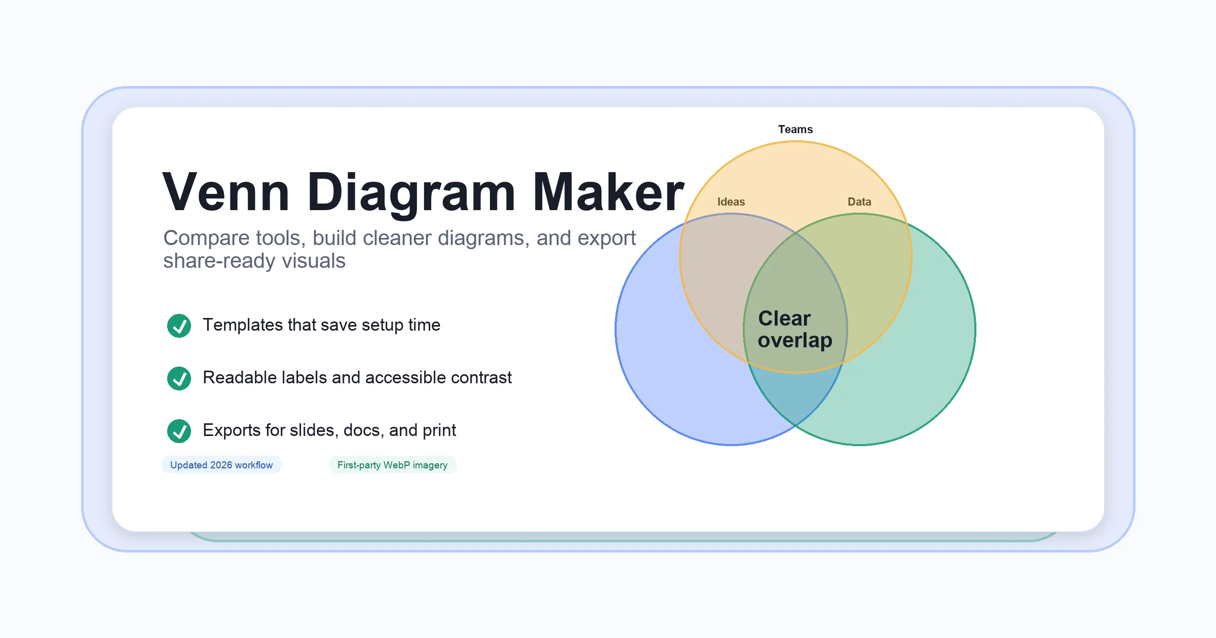
Venn Diagrams Made Simple: Clear Visuals, Fast Results
Venn Diagrams
Have you ever tried to compare two options or spot connections between different groups, only to get lost in a sea of details? Sounds complex, right? That’s where Venn diagrams come in—a classic, intuitive tool that transforms abstract relationships into clear, visual patterns you can grasp at a glance.
What Is a Venn Diagram?
A Venn diagram is a graphic that uses overlapping circles (or other shapes) to represent relationships between sets—groups of items, ideas, or data. Where the circles overlap, you’ll notice shared traits; where they don’t, you’ll see what makes each set unique. This simple visual method helps you quickly compare, contrast, and connect information, making even complex data more accessible and understandable(Wikipedia).
-
Each circle stands for a set—a collection of related things, such as numbers, products, or people.
-
The overlapping areas show what the sets have in common.
-
Non-overlapping areas highlight differences between the sets.
From 19th-Century Logic to Modern Data Analysis
The story of the Venn diagram begins with John Venn, a British mathematician and logician, who introduced these diagrams in an 1880 paper. While earlier thinkers like Euler and Leibniz used similar diagrams, Venn’s innovation was to systematically show_all_possible logical relationships between sets, regardless of whether they existed in a specific example(Number Analytics). The term “Venn diagram” itself was coined later, in 1918, but the method quickly became a staple in mathematics, logic, and beyond.
Why Venn Diagrams Stand the Test of Time
What makes Venn diagrams so enduring? Their strength lies in their simplicity. With just a few overlapping shapes, you can:
-
Visualize similarities and differences between groups
-
Clarify complex relationships in data or ideas
-
Support logical reasoning and decision-making
Today, you’ll find Venn diagrams everywhere—from classrooms explaining set theory, to business meetings comparing product features, to data analysts mapping patterns in large datasets(Investopedia). Their ability to make connections visible and accessible is why they remain a go-to method for anyone looking to organize, compare, or analyze information.
In the following sections, we’ll break down the basics of how Venn diagrams work, explore their practical uses, and guide you through creating your own clear, effective visualizations.
Grasping the Basics
When you first encounter a Venn diagram, it might look like just a few circles on a page. But what does it really mean? Let’s demystify the key parts and symbols that make these diagrams so powerful for visualizing relationships and solving problems.
Understanding the Building Blocks
At its core, a Venn diagram is a visual tool for showing how different groups (called_sets_) relate to each other. Each circle represents a set, and the way circles overlap or stand apart reveals what the sets have in common and what makes them unique(GeeksforGeeks).
-
Set: A collection of items or elements that share a common property. For example, Set A could be all even numbers between 1 and 10: {2, 4, 6, 8, 10}.
-
Universal Set: The larger group that includes all possible items under consideration. In a diagram, this is usually shown as a rectangle surrounding all circles. For example, if you’re comparing fruits and vegetables in a market, the universal set could be all produce items available.
-
Subset: A set whose elements are all contained within another set. If every item in Set A is also in Set B, then A is a subset of B.
Key Venn Diagram Symbols and Their Meanings
To really understand thevenn diagram definitionand how to interpret these visuals, it helps to know the main symbols and what they represent. Here’s a quick guide:
-
Union (∪): Combines all elements from two or more sets. The union of Set A and Set B (written A ∪ B) includes everything in A, B, or both. Visually, this means shading_all_areas covered by the circles for A and B.
-
Intersection (∩): Shows only the elements common to both sets. The intersection of A and B (A ∩ B) is where the circles overlap—those items shared by both sets.
-
Complement ('): Includes everything in the universal set that’s_not_in a particular set. For example, A' (read as “A complement”) means all items outside Set A but still within the universal set.
-
Difference (−): The elements in one set that are not in another. A − B means all items in A that aren’t in B.
-
Empty Set (∅): Represents a set with no elements—think of it as an area of the diagram with nothing inside.
How These Concepts Look in a Venn Diagram
Imagine two overlapping circles inside a rectangle:
-
The rectangle is the universal set.
-
Each circle is a set (A and B).
-
The overlapping area is the intersection (A ∩ B)—items in both sets.
-
The area covered by either circle is the union (A ∪ B).
-
The space outside the circles but inside the rectangle is the complement—items not in A or B.
For example, if Set A is {apples, bananas, grapes} and Set B is {carrots, lettuce, apples}, the intersection (A ∩ B) is {apples}—the item they share. The union (A ∪ B) is {apples, bananas, grapes, carrots, lettuce}(GeeksforGeeks).
Why These Basics Matter
Once you understand these building blocks, you’ll find it much easier to use Venn diagrams to solve problems, compare options, or analyze data. The next section will dive into the practical benefits of visualizing sets and how this approach can help you clarify complex information in everyday scenarios.
The Purpose and Power of Visualizing Sets
Ever wondered_why_Venn diagrams keep showing up in classrooms, boardrooms, and data reports? When you’re faced with a jumble of information—overlapping ideas, competing choices, or tangled data—Venn diagrams offer a way to cut through the confusion and see connections that might otherwise stay hidden. But what is a Venn diagram really_for_? Let’s explore the real-world value behind this visual tool and why it remains a favorite for so many problem-solvers.
Making Complex Data Simple and Accessible
At their core, Venn diagrams are designed tosimplify complexity. Instead of sifting through endless lists or spreadsheets, you can map out relationships between sets with just a few circles. This instantly makes similarities and differences visible, helping you spot patterns or gaps you might otherwise miss.
-
**Clarifying relationships:**Overlapping areas reveal what sets have in common, while non-overlapping sections highlight unique features. Imagine comparing two products, two research findings, or two groups of people—you’ll quickly see both shared and distinct traits(Xmind).
-
**Simplifying data:**By grouping and visualizing information, Venn diagrams break down complex datasets into manageable, easy-to-understand visuals.
-
**Supporting logical reasoning:**The visual structure helps you follow logical relationships and test hypotheses. For example, you might use a Venn diagram to check if two marketing strategies target the same customer segments or to see which tasks overlap between team members.
-
**Enhancing decision-making:**With the big picture in front of you, it’s easier to make informed choices—whether you’re prioritizing features, allocating resources, or planning a project.
Key Advantages of Using Venn Diagrams
Still not convinced? Here are some of the main benefits you’ll gain by using Venn diagrams in your work or studies:
-
Quickly compare and contrast options—see at a glance where ideas or data points overlap or diverge.
-
Communicate findings clearly—visuals can bridge gaps in understanding, especially when explaining complex topics to others.
-
Identify relationships and trends—spot hidden connections or unexpected overlaps.
-
Facilitate collaboration—teams can brainstorm, organize, and prioritize more effectively with shared visuals.
Where Venn Diagrams Shine: Real-World Applications
So,what is a Venn diagramused for in practice? The answer: almost anywhere you need to organize, compare, or analyze information. Here’s how they make a difference across different fields:
-
**Education:**Teachers use Venn diagrams to help students compare historical events, literary characters, or scientific concepts, making learning more interactive and memorable(Xmind).
-
**Business:**Marketers and strategists rely on Venn diagrams to segment audiences, compare competitors, or map out overlapping product features for better decision-making(CFI).
-
**Mathematics and Statistics:**Venn diagrams are essential for visualizing set theory, probability, and data relationships, helping users understand unions, intersections, and complements.
-
**Everyday Problem-Solving:**From planning family events to organizing chores, Venn diagrams help clarify who does what, what’s shared, and what’s unique.
"Venn diagrams provide a visual tool for strategic planners to identify, analyze, and interpret data related to the decision making process."
By now, you’ve seen that the venn diagram meaning goes far beyond simple circles on a page. It’s about making sense of complexity, encouraging logical thinking, and supporting smarter choices. Next, we’ll look at how to choose the right tools for creating your own clear, effective Venn diagrams—so you can put these benefits into action.
Finding Your Ideal Venn Diagram Maker or Generator
When you’re ready to create your own Venn diagrams, the next question is—what’s the best way to do it? Should you sketch by hand, use a general-purpose program, or try a specializedvenn diagram makerorvenn diagram generator? With so many options out there, picking the right tool can feel overwhelming. Let’s break down the possibilities and help you find a solution that matches your workflow, whether you’re a student, teacher, business analyst, or project manager.
What Should You Look for in a Venn Diagram Tool?
Imagine you need to compare product features for a business report, or map out overlapping skills in a team meeting. You want a tool that’s fast, flexible, and easy to share with others. Here’s what matters most:
-
**Ease of Use:**Can you build and edit diagrams quickly—even if you’re new to the software?
-
**Customization:**Are you able to adjust colors, shapes, labels, and layout to fit your needs?
-
**Integration:**Does the tool work well with other apps (like Google Docs, PowerPoint, or cloud storage)?
-
**Cost:**Is there a free version, or do you need to pay for advanced features?
-
**Collaboration:**Can you invite others to edit or view your diagrams in real time?
-
**Export Options:**Will you be able to save or share your diagram in the format you need (PDF, PNG, HTML, etc.)?
Comparing Popular Venn Diagram Makers and Generators
Let’s take a closer look at some of the top tools available, including online platforms and template-based solutions. The table below compares key features to help you decide whichvenn diagram generatorbest fits your needs(DolarApp):
| AFFiNE Venn Diagram Template | Very Easy | High | Cross-platform, cloud sync | Free & Paid | Yes | HTML, Markdown, PDF, Print |
|---|---|---|---|---|---|---|
| Lucidchart | Easy | High | Google, MS Office, more | Free & Paid | Yes | Multiple formats |
| Creately | Easy | High | Desktop & Online | Free & Paid | Yes | Image, PDF |
| GitMind | Very Easy | Moderate | Browser-based | Free & Paid | Yes | Image, PDF |
| Canva | Very Easy | Moderate | Web, Mobile | Free & Paid | Yes | JPEG, PNG, PDF |
| Microsoft Office (Word/Excel/PowerPoint) | Easy | Basic | Offline, Office Suite | Requires License | Yes | Office formats |
Why Template-Based Platforms Like AFFiNE Stand Out
If you want to create a Venn diagram that’s both professional and fast, template-based solutions like AFFiNE’s Venn Diagram Template offer unique advantages. With AFFiNE, you get:
-
An intuitive drag-and-drop interface—no design skills required
-
Customizable overlapping circles for clear data visualization
-
Cloud storage and true cross-platform support (Web, macOS, Windows, Linux, iOS, Android)
-
Real-time collaboration and easy sharing for teams
-
Export options including HTML, Markdown, PDF, and print-ready formats
-
Special features like "Ask AI" for brainstorming or creating to-do lists, and an edgeless canvas for creative layouts
Template-based tools save time by providing ready-made frameworks, but they also let you customize every detail to fit your specific needs—whether you’re presenting to a class, collaborating on a business project, or analyzing research data(AFFiNE Blog).
Which Venn Diagram Generator Is Right for You?
Here’s a quick guide to help you decide:
-
**For quick, visually polished diagrams:**Try AFFiNE or Canva for ready-to-use templates and easy customization.
-
**For advanced features and integrations:**Lucidchart and Creately offer robust design tools and team collaboration.
-
**For free, browser-based simplicity:**GitMind or Canva are great starting points.
-
**For offline work:**Microsoft Office apps are familiar and accessible if you already have them installed.
Ultimately, the bestvenn diagram makerorvenn diagram generatoris the one that fits your workflow, supports your collaboration needs, and helps you turn complex data into clear, actionable insights. As you move forward, consider how templates can further speed up the process—making your next diagram both professional and effortless.
Using Templates for Quick Venn Diagram Creation
Ever stared at a blank page, wondering how to get started with your next diagram? Or maybe you’ve spent too much time adjusting circles and labels, only to end up with a lopsided chart? If that sounds familiar, you’re not alone. That’s exactly why pre-designedvenn diagram templateshave become a go-to solution for students, educators, and professionals alike. Let’s explore how these templates can transform your workflow—and why they’re especially valuable for beginners or anyone working on tight deadlines.
The Power of Templates: Save Time and Ensure Consistency
Imagine you’re preparing a business presentation, a classroom lesson, or a data comparison report. Instead of building your diagram from scratch, avenn diagram templateoffers a polished starting point. Here’s how templates make your life easier:
-
**Instant structure:**No more fussing over circle sizes or placement—just open the template and start adding your data.
-
**Visual consistency:**Templates keep your diagrams neat and professional, ensuring that every chart you create follows the same clear style.
-
**Time savings:**With a ready-made layout, you can focus on content and insights, not formatting or design tweaks.
-
**Beginner-friendly:**Even if you’ve never made a diagram before, templates guide you through the process, reducing errors and guesswork.
-
**Easy customization:**Most templates allow you to adjust colors, labels, and content to match your needs—perfect for branding, teaching, or analysis.
-
**Reliable results:**You’ll notice that templates minimize the risk of mistakes, so your diagrams communicate clearly every time.
Why Digital Templates Outperform Paper or Blank Venn Diagrams
While blank venn diagrams on paper are great for brainstorming, digital templates offer far more flexibility and efficiency. You can:
-
Duplicate diagrams for recurring comparisons
-
Collaborate in real time with team members or classmates
-
Export your diagram to various formats (PDF, HTML, Markdown) for presentations or reports
-
Store and access your diagrams from any device, thanks to cloud support
This digital workflow is especially useful for frequent users, such as teachers preparing multiple lessons or professionals managing ongoing projects(AFFiNE Blog).
Meet AFFiNE's Venn Diagram Template: Fast, Flexible, and Feature-Rich
Looking for a user-friendly, customizable solution?AFFiNE’s Venn Diagram Templateis designed to help you create clear, professional diagrams in minutes. Here’s what sets it apart:
-
**Customizable overlapping circles:**Easily adjust the number of sets, colors, and labels to fit your data.
-
**Edgeless canvas mode:**Build diagrams alongside notes, mind maps, or other visual elements for richer content.
-
**Cloud storage and cross-platform support:**Access your work on web, desktop, or mobile devices—always synced and ready to share.
-
**Export and print options:**Download your diagram as PDF, HTML, or Markdown, or print it for offline use.
-
**AI-powered assistance:**Use built-in AI tools to generate to-do lists or brainstorm diagram content on the fly.
Whether you’re mapping out project requirements, comparing research findings, or teaching students to analyze similarities and differences, AFFiNE’s template gives you a head start—no design skills required. The result? Faster diagrams, clearer communication, and more time to focus on what matters most: your insights.
Ready to see how templates simplify the process? Next, we’ll dive into constructing and interpreting two- and three-circle diagrams—so you can start using these tools for any comparison task, large or small.
Mastering Two and Three Circle Venn Diagrams
Ever wondered how to break down similarities and differences between two or three groups—whether you’re comparing products, sorting survey data, or organizing ideas? Two- and three-circle Venn diagrams are your go-to solution. Let’s walk through how each type works, and how you can use them to make sense of any comparison.
How Two-Circle Venn Diagrams Work
Picture this: You’re comparing two categories—say, people who play piano and people who play guitar. A two-circle Venn diagram uses two overlapping circles, each one representing a set. Where the circles overlap, you’ll see what’s shared between the two sets. Where they don’t, you’ll spot what’s unique to each group(Lucidchart).
-
**Left circle:**All items unique to Set A (e.g., piano players only).
-
**Right circle:**All items unique to Set B (e.g., guitar players only).
-
**Overlap (intersection):**Items shared by both sets (e.g., people who play both instruments).
-
**Outside both circles:**Items not in either set (if shown, as part of the universal set).
For example, if 6 people play piano, 12 play guitar, and 4 play both, the overlapping section would show 4, while the non-overlapping parts would show 2 (piano only) and 8 (guitar only)(StudyPug).
Unlocking the Power of Three Circle Venn Diagrams
Need to compare three groups at once? Thethree circle Venn diagram(also called a 3 circle Venn diagram) is designed for exactly that. Imagine three overlapping circles, each representing a different set—like basketball, football, and tennis players in a class. The diagram’s structure reveals every possible combination of shared or unique attributes(Maths at Home).
-
**Individual circles:**Items unique to each set (e.g., only basketball players).
-
**Pairwise overlaps:**Items shared by exactly two sets (e.g., those who play both basketball and tennis, but not football).
-
**Center overlap (all three):**Items shared by all three sets (e.g., students who play basketball, football, and tennis).
-
**Outside all circles:**Items that don’t belong to any of the sets (e.g., students who play none of the sports).
Let’s see this in action. Suppose you survey 30 students about which sports they play. Start by filling in the center (those who play all three). Next, add numbers to the overlapping regions for each pair of sports, making sure not to double-count those already in the center. Finally, fill in the unique sections for each sport, and don’t forget to include anyone who doesn’t play any of the sports outside the circles. This method ensures every student is counted once and only once(Maths at Home).
| Single circle only | Unique to one set | Plays only basketball |
| Overlap of two circles | Shared by two sets | Plays basketball and tennis |
| Center overlap (all three) | Shared by all sets | Plays basketball, football, and tennis |
| Outside all circles | Not in any set | Plays none of the sports |
Tips for Interpreting and Using Two- and Three-Circle Venn Diagrams
-
Always start by filling in the center (shared by all sets) to avoid double-counting.
-
Work outward, filling in pairwise overlaps, then the unique sections of each set.
-
Check your totals—make sure every item or person is counted in exactly one region.
-
Use color or shading to highlight intersections and make patterns stand out.
Whether you’re comparing two product features or mapping three overlapping team skills, mastering these diagrams helps you visualize every possible relationship. Next, let’s look at how these basic structures adapt to real-world examples—so you can apply them to your own projects with confidence.
Learning from Diverse Venn Diagram Examples
Ever wondered how you might use a Venn diagram beyond the classroom? The beauty of these diagrams lies in their flexibility—they can be adapted to nearly any scenario where you need to compare, organize, or analyze information. Let’s dive into some practical venn diagram examples that show just how versatile this tool can be, whether you’re in business, science, education, or creative fields.
Venn Diagram Example Scenarios
Imagine you’re faced with a decision, a dataset, or a brainstorming session. Here’s how the basic structure of a Venn diagram adapts to different real-life needs:
-
**Comparing Product Features:**Picture two circles—one for Product A, another for Product B. The overlapping section highlights features both share, while the non-overlapping areas show what’s unique to each. This makes it easy to spot competitive advantages or gaps when presenting to stakeholders.
-
**Mapping Team Skills:**Use three circles to represent skillsets like design, coding, and marketing. The intersections reveal team members who bridge multiple disciplines, helping you assign roles or identify training needs.
-
**Analyzing Literary Characters:**In literature classes, Venn diagrams compare characters’ traits, motivations, or relationships. Overlaps show shared qualities, while unique sections highlight differences—making it easier for students to organize their analysis.
-
**Solving Math and Probability Problems:**In mathematics, Venn diagrams help visualize set operations or probability questions. For example, you can map students who like different subjects to quickly calculate overlaps and differences.
-
**Business and Market Research:**Businesses use Venn diagrams to segment customers, compare market trends, or analyze overlapping needs. This visual approach helps teams see where products or audiences intersect, guiding smarter decisions.
-
**Database and Computer Science:**In IT, Venn diagrams clarify relationships between data tables, schemas, or algorithms—making complex structures easier to understand and optimize(Mindomo).
-
**Brainstorming and Creative Projects:**Artists and writers use Venn diagrams to generate ideas, find thematic overlaps, or organize concepts for new projects. The visual format encourages creative thinking and collaboration.
Why These Venn Diagram Examples Work
You’ll notice that in each venn diagram example, the overlapping circles serve as a bridge—helping you see connections, spot differences, and organize information in a way that’s instantly clear. Whether you’re comparing pets in a household, mapping out weather phenomena, or analyzing gene expression in bioscience, the structure stays the same: circles for sets, overlaps for shared traits, and unique areas for differences.
Putting It Into Practice
Ready to try it yourself? Start with a simple scenario—like comparing your top three vacation destinations, or mapping the skills in your team. Once you see how easy it is to adapt the Venn diagram structure, you’ll find endless ways to use this tool for analysis, planning, or creative thinking. In the next section, we’ll show how to tailor these diagrams for unique questions or specialized topics—so you can make your visuals truly your own.
Applying Venn Diagrams to Specific Topics and Ideas
Ever wondered if Venn diagrams can handle more than just basic comparisons? Imagine you’re exploring a complex business challenge or analyzing a historical event—suddenly, those overlapping circles become a powerful way to break down unique questions. Let’s walk through how you can tailor these diagrams to fit your own interests, from customer success strategies to nuanced historical debates.
How to Define Sets for Your Unique Scenario
When you create a Venn diagram for a specialized topic, the first step is to decide what each circle—or set—should represent. Ask yourself:
-
What are the main elements, groups, or concepts I want to compare?
-
Where do these elements overlap, and what makes them distinct?
-
What is my goal—finding common ground, highlighting differences, or mapping gaps?
Choosing the right sets is crucial. The more clearly you define them, the easier it is to visualize relationships and draw meaningful insights.
Example 1: Customer Success Venn Diagram
Imagine you’re a Customer Success Manager aiming to deliver the best possible experience for your clients. What skills or approaches drive real results? A customer success venn diagram can help you visualize the intersection of key competencies.
-
**Set 1:**Active Listening—understanding client needs and concerns
-
**Set 2:**Empathy—connecting with clients on a personal level
-
**Set 3:**Open-Ended Questions—encouraging deeper conversations
Where all three circles overlap, you’ll find the "sweet spot" of customer success: building genuine connections, uncovering hidden challenges, and driving positive outcomes. This approach, as discussed by industry experts, emphasizes that true value is delivered when you combine these skills—not just use them in isolation(SuccessCOACHING).
Example 2: Stalin vs. Hitler Venn Diagram
Now, let’s shift gears to a historical comparison. Suppose you’re analyzing the leadership styles of Joseph Stalin and Adolf Hitler for a research project. Astalin hitler venn diagram makes it easier to organize similarities and differences.
-
**Set 1:**Stalin—policies, ideology, and leadership traits unique to the Soviet Union
-
**Set 2:**Hitler—characteristics specific to Nazi Germany
-
**Overlap:**Shared features such as authoritarian rule, propaganda use, and centralized power
By mapping these attributes, you’ll quickly see where the two leaders aligned and where they diverged, making your analysis clearer and more structured(Mindomo).
Tips for Customizing Venn Diagrams for Any Topic
-
Start with a clear question or goal—know what you want to compare or uncover
-
Define your sets precisely—avoid overlap that’s too broad or too narrow
-
Use additional circles if needed—but keep it readable
-
Label each section clearly, and consider using color to highlight key overlaps
Whether you’re brainstorming in business, exploring historical figures, or analyzing scientific data, adapting Venn diagrams to your unique topic helps you organize information and spark new insights. Next, we’ll share best practices to make your diagrams both clear and visually appealing—so your ideas always come through loud and clear.
Tips for Crafting Clear and Effective Venn Diagrams
When you sit down to create a Venn diagram, do you ever wonder how to make it both eye-catching and easy to understand? Whether you’re mapping out business strategies, teaching set theory, or brainstorming ideas, the difference between a confusing diagram and a compelling one often comes down to a few simple choices. Let’s break down the essentials forvenn diagram creationthat communicates your message with clarity and impact.
Start with Purpose and Structure
Before you draw a single circle, ask yourself: What am I trying to show? Are you comparing two products, illustrating overlapping skill sets, or analyzing survey data? Defining your goal helps you choose the right number of sets, the best layout, and what information belongs where(SketchWow).
-
**Keep it simple:**Use only as many circles (or shapes) as your data truly requires. More isn’t always better—too many sets can clutter your diagram and confuse viewers(YouExec).
-
**Choose clear shapes:**Circles are classic, but other shapes work too—just make sure overlaps are distinct and readable.
Labeling and Clarity
-
**Label every set and region:**Each circle should have a clear, concise label. If you’re comparing three sets, make sure every overlap and unique area is easy to identify. For complex diagrams, consider adding a legend.
-
**Use meaningful titles:**A descriptive title at the top helps viewers immediately understand the diagram’s purpose.
-
**Keep text brief:**Avoid long sentences inside the diagram—use keywords or short phrases for quick scanning.
Color and Visual Design
-
**Choose contrasting colors:**Select colors that are easy to distinguish. This makes it simple to spot overlaps and unique sections. Be mindful of colorblindness—use patterns or textures if possible.
-
**Maintain consistency:**Use the same color for each set across all related diagrams, especially in presentations or reports.
-
**Highlight key overlaps:**Use shading or bold outlines to draw attention to the most important intersections.
Accuracy and Data Placement
-
**Double-check your data:**Ensure every item or data point is in the correct region. Misplaced data can lead to misinterpretation(SketchWow).
-
**Start with the center:**For two- or three-set diagrams, fill in the center (shared by all sets) first, then work outward. This helps avoid double-counting and keeps your diagram accurate(Eedi).
-
**Review for clarity:**Step back and ask, “Can someone new to the topic understand this at a glance?”
Tips for Advanced Venn Diagram Creation
-
**Test with examples:**If you’re teaching or collaborating, try sorting sample items into the diagram before finalizing. This helps reveal misunderstandings or gaps(Eedi).
-
**Encourage collaboration:**Use mini-whiteboards or digital tools to let others contribute and discuss placement, especially in group settings.
-
**Challenge yourself:**For deeper insight, try generating examples for every region—including those that seem unlikely or empty. This can help uncover exceptions and strengthen your analysis.
Avoiding Common Pitfalls
-
**Don’t overload with information:**Too much detail can overwhelm. Focus on the main points you want to communicate.
-
**Watch for ambiguous overlaps:**Make sure every shared region is clearly defined and labeled—unclear overlaps can confuse your audience.
-
**Maintain balance:**Evenly space your circles or shapes so the diagram looks organized and is easy to read.
By following these best practices, you’ll create Venn diagrams that are not only visually appealing but also make your insights easy for anyone to grasp. Up next, we’ll recap the biggest benefits of using these diagrams and encourage you to start experimenting with your own—so your next project stands out for all the right reasons.
Conclusion
Ever found yourself searching for a way to untangle complex ideas or present your findings with clarity? That’s the magic ofvenn diagrams—they don’t just organize information, they help you see the big picture, spot hidden connections, and communicate your insights with confidence.
Why Venn Diagrams Remain an Essential Tool
After exploring their history, structure, and real-world applications, it’s clear that Venn diagrams stand out for their:
-
**Simplicity:**With just a few overlapping circles, even complicated relationships become instantly understandable(Xmind).
-
**Versatility:**Whether you’re comparing products, mapping skills, or analyzing historical figures, these diagrams adapt to almost any scenario.
-
**Visual power:**They turn abstract concepts into concrete visuals, making your message stick with any audience.
-
**Decision support:**By highlighting similarities, differences, and overlaps, venn diagrams guide better choices in business, education, and personal projects(AFFiNE).
-
**Collaboration:**Their straightforward format invites group discussion and makes teamwork more effective.
Ready to Apply What You’ve Learned?
Imagine you’re preparing a project proposal, teaching a class, or brainstorming your next big idea. Instead of getting lost in lists or spreadsheets, you can use a venn diagram to:
-
Clarify where ideas or data points overlap and where they stand apart
-
Spot gaps, redundancies, or opportunities at a glance
-
Communicate your findings with visuals that anyone can understand
And you don’t need to start from scratch. With tools like AFFiNE’s Venn Diagram Template, you can create professional, customizable diagrams in minutes. The template’s intuitive design, edgeless canvas, and cross-platform support mean you can work from anywhere—and collaborate with anyone. Plus, features like AI-powered assistance and easy export options make the process even smoother, whether you’re working solo or with a team.
Your Next Steps: Start Creating with Confidence
So, what’s stopping you from putting these insights to work? Here’s how you can get started:
-
Pick a topic or challenge you want to clarify—big or small
-
Define your sets and what you want to compare
-
Choose a template or tool that fits your workflow
-
Visualize, analyze, and share your findings
Whether you’re a student, educator, business leader, or creative thinker, venn diagrams give you the edge for clear analysis and persuasive communication. Why not make your next project easier—and more impactful—by exploring what a professional template can do?
Try out a ready-made solution like AFFiNE’s Venn Diagram Template today, and see how quickly you can turn complex ideas into clear, actionable visuals. Your next breakthrough might be just a few circles away.
Frequently Asked Questions About Venn Diagrams
1. How do you explain a Venn diagram?
A Venn diagram uses overlapping circles to visually organize and compare sets, highlighting both shared and unique elements. This helps users quickly see similarities, differences, and relationships between groups, making complex information more accessible and easier to analyze.
2. What is Venn diagram best used for?
Venn diagrams are best for comparing and contrasting sets, ideas, or data. They're widely used in education for teaching concepts, in business for product comparisons or market segmentation, and in data analysis to clarify relationships and support decision-making.
3. What does ∩ mean in Venn diagrams?
In Venn diagrams, the symbol ∩ stands for 'intersection.' It represents the elements that are common to all selected sets, visually shown as the overlapping area between circles. This is crucial for identifying shared traits or data points.
4. How do you solve a Venn diagram easily?
To solve a Venn diagram problem, start by identifying the total items in each set and their overlaps. Fill in the intersection (shared area) first, then work outward to unique sections. Double-check totals to avoid double-counting and ensure clarity.
5. What are the advantages of using a Venn diagram template like AFFiNE’s?
Using a template like AFFiNE’s Venn Diagram Template saves time, ensures visual consistency, and simplifies customization. It allows for quick creation, easy editing, cloud storage, and supports exporting in multiple formats. The intuitive design helps users of all levels create professional, clear diagrams for any project.