Unlock Effortless Visuals: Your Venn Diagram Generator Resource
Introduction to Venn Diagram Generator Tools
When you need to compare ideas, analyze data, or make complex relationships easily understood, what tool comes to mind? For many, the answer is the Venn diagram—a simple yet powerful way to visualize how sets overlap and differ. But if you’ve ever tried to draw one by hand for a meeting or a school project, you know it can quickly get messy and time-consuming. Sounds familiar? That’s where avenn diagram generatorsteps in, transforming a tedious task into an effortless process for students, teachers, business professionals, and anyone in need of clear visual communication.
What Is a Venn Diagram?
At its core, a Venn diagram is a visual tool that uses overlapping circles to represent relationships between sets, groups, or categories. Where the circles overlap, you’ll see shared characteristics or data points; where they don’t, differences stand out. This method, first formalized by mathematician John Venn in the 1880s, has become a staple in fields like mathematics, statistics, logic, linguistics, computer science, and business presentations(Corporate Finance Institute). Whether you’re comparing products, analyzing survey results, or mapping out project responsibilities, Venn diagrams help you organize information visually so it’s easier to digest.
Common Uses for Venn Diagrams
-
**Comparisons:**Spot similarities and differences between two or more items, such as products, services, or concepts.
-
**Data Analysis:**Visualize how data sets intersect or diverge—especially useful in statistics or market research.
-
**Presentations:**Make complex relationships clear for your audience, whether in a classroom, boardroom, or report.
-
**Project Management:**Clarify team roles, task overlaps, or shared resources.
Venn diagrams are so familiar that even non-technical audiences can quickly grasp their meaning, making them a go-to for both education and business settings(Klaxoon).
The Challenge of Manual Diagramming
Drawing Venn diagrams by hand or with generic tools can be limiting. You might struggle to get the proportions right, line up the overlaps, or fit all your data neatly inside the circles. As the number of sets increases—say, from two to three or more—the complexity grows, and so does the risk of confusion or errors.
How a Venn Diagram Generator Makes Life Easier
Imagine being able to create polished, accurate diagrams in just a few clicks. Avenn diagram generatoris a digital tool designed to automate the process, letting you:
-
Quickly add or remove circles for different sets
-
Label each section with ease
-
Customize colors and styles for clarity
-
Export your diagram for use in reports or slides
With these tools, you’ll notice that even complex comparisons become manageable, and your visuals always look professional.
What to Expect from This Guide
This comprehensive guide will walk you through everything you need to know about Venn diagram generators. You’ll learn how to choose the right tool for your needs, discover tips for designing effective diagrams, and explore advanced features for handling more complex data. Whether you’re a student aiming for clarity in your assignments or a professional seeking impactful presentations, you’ll find practical advice to unlock the full potential of Venn diagrams—without the hassle of manual drawing.
Why Use a Venn Diagram Generator
Ever tried to create a Venn diagram by hand or with basic drawing tools, only to end up frustrated by uneven circles or messy overlaps? When you need to present complex relationships clearly—whether in a classroom, meeting, or report—accuracy and visual appeal matter. This is where a venn diagram generator truly shines, turning a once-tedious task into a streamlined, reliable process.
The Key Advantages of a Venn Diagram Generator
Imagine preparing for a big presentation or analyzing data for a report. Would you rather spend time fussing with shapes and lines, or focus on your insights and message? Here’s how a dedicated generator simplifies your workflow and enhances your results:
-
**Speed:**Instantly create diagrams with just a few clicks—no more painstakingly drawing circles or adjusting overlaps by hand. Many generators offer ready-made templates, so you can jump right in and start visualizing your data(TextMagic).
-
**Accuracy:**Automatically align circles, intersections, and labels for perfect proportions every time. This reduces errors and ensures your visualizations are mathematically and logically sound(Lucidchart).
-
**Customization:**Easily adjust colors, sizes, borders, and text to match your brand or make specific points stand out. You can add or remove circles, change background colors, and insert images or icons for extra clarity(TextMagic).
-
**Accessibility:**Work from any device with online generators—no need to install software or worry about compatibility. Share your diagrams via links, download in various formats (PNG, SVG, PDF), or embed them directly into presentations or documents.
-
**Collaboration:**Many online tools allow you to share and co-edit diagrams in real time, making teamwork on projects or group assignments much easier(Lucidchart).
How These Benefits Elevate Your Visuals
Let’s break down why these features matter in practice:
-
**Professional Appearance:**Consistent shapes, smooth intersections, and crisp text give your diagrams a polished look that’s suitable for any audience—from students to executives.
-
**Enhanced Clarity:**Customizable colors and labels help you highlight key relationships and make your data or arguments easier to understand.
-
**Time Savings:**With templates and intuitive interfaces, you can go from idea to finished diagram in minutes, freeing up time for analysis and discussion.
-
**Reduced Cognitive Load:**Instead of wrestling with formatting, you can focus on what matters—insights, comparisons, and decision-making.
Real-World Example
Suppose you’re comparing three marketing strategies for a campaign. Using avenn diagram generator, you can quickly map out overlapping audiences, unique features, and shared benefits. Adjust colors to match your brand, add notes to intersections, and export the diagram for your next meeting. The result? A clear, compelling visual that communicates your analysis at a glance.
As you explore the variety of tools available, you’ll notice that the right generator can make even the most complex comparisons manageable. For a broader side-by-side review of template-based, presentation, and collaborative options, see the Venn diagram maker guide. Next, we’ll look at how to find the best free and online Venn diagram solutions.
Finding Top Free and Online Venn Diagram Solutions
Ever found yourself needing to compare two ideas, but drawing circles by hand just isn’t cutting it? Or maybe you’ve tried a basic drawing app, only to get tangled up in formatting and alignment. That’s where avenn diagram generator freecomes in—offering a smarter, faster way to create clear, professional visuals without the hassle. But with so many options out there, how do you pick thebest free venn diagram generatorfor your needs?
What Makes the Best Free and Online Venn Diagram Generator?
Imagine you’re prepping for a class, a team meeting, or a data analysis project. You want a tool that’s not only quick but also flexible and user-friendly. Here are the key criteria to consider when choosing a free venn diagram generator:
-
**Ease of Use:**Does the interface let you drag, drop, and label circles without a learning curve? Intuitive controls make a huge difference, especially if you’re working under time pressure(GitMind Review).
-
Number of Sets Supported:Can you create diagrams with two, three, or more circles? Somevenn diagram online generatorsare limited to basic 2-set diagrams, while others let you build more complex visuals for advanced comparisons.
-
**Export Options:**Look for the ability to download your diagram as an image (PNG, SVG), PDF, or even embed it in a presentation. This ensures your work is ready for sharing, printing, or presenting.
-
**Ad Intrusiveness:**Some free tools keep things clean, while others clutter your workspace with ads or limit features unless you upgrade. Pay attention to how much these distractions might impact your workflow.
-
**Templates and Customization:**Starting with a high-quality template—like AFFiNE’s Venn Diagram Template—can save you time and help you organize information more effectively. Templates provide a polished starting point, so you can focus on content instead of formatting(AFFiNE).
Comparison of Leading Free Online Venn Diagram Generators
To help you decide, here’s a side-by-side look at some of the most popularonline venn diagram generatortools. This table breaks down their key features, so you can quickly spot which one fits your needs:
| AFFiNE Venn Diagram Template | Very intuitive | 2-3+ (customizable) | HTML, Markdown, PDF, Print | None | Yes (pre-designed, customizable) | Yes (cloud, cross-platform) |
|---|---|---|---|---|---|---|
| GitMind | Easy | 2-4 | PNG, SVG, PDF | Minimal | Yes | Yes |
| Visual Paradigm | Moderate | 2-3 | PNG, PDF | Minimal (in free version) | Yes (limited in free) | Yes |
| Canva | Very easy | 2-3 | PNG, PDF | Low | Yes | No (in free version) |
| Creately | Easy | 2-3 | PNG, PDF | Low | Yes | Yes |
| Gliffy | Easy | 2-3 | PNG | Low (trial version) | Yes | No |
| Classtools.net | Very basic | 2-3 | Image file | Low | No | No |
| App.diagram.net | Moderate | 2-4+ | PNG, SVG, PDF | None | No | Yes |
Why Start with a Quality Template?
When you’re short on time or need to ensure your diagram looks polished, starting with a template is a game changer. AFFiNE’s Venn Diagram Template, for example, gives you a ready-made structure—just fill in your sets and labels. Its cloud storage, cross-platform compatibility, and export features mean you can work anywhere and share your results instantly(AFFiNE). This approach is especially helpful for educators, analysts, or anyone managing complex data.
Choosing the Right Tool for You
So, what’s the best free venn diagram generator? It depends on your needs:
-
**For quick, basic diagrams:**Try Classtools.net or Canva.
-
**For collaboration and advanced features:**AFFiNE, GitMind, or Creately stand out.
-
**For maximum customization and export options:**AFFiNE and App.diagram.net are excellent choices.
Whichevervenn diagram online generatoryou pick, focus on what matters most: clarity, ease, and flexibility. Next, we’ll show you how to create simple Venn diagrams quickly and effectively—no artistic skills required.
Creating Simple Venn Diagrams Quickly with a Simple Venn Diagram Generator
When you want to compare two products, highlight similarities and differences between ideas, or present survey results, wouldn’t it be great to have a visual that’s easy to create and instantly clear? That’s exactly what a simple venn diagram generator is built for. But what does “simple” really mean in this context, and how can you make the most of these tools?
What Makes a Venn Diagram Simple?
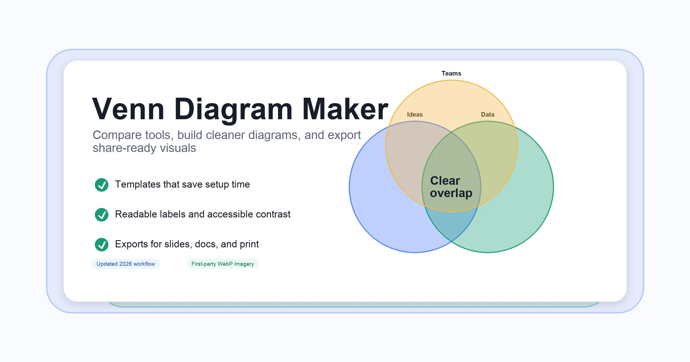
Simple Venn diagrams typically involve two or three overlapping circles—just enough to compare basic sets or ideas without overwhelming your audience. Think of classic school assignments: comparing cats and dogs, or mapping out what’s shared and unique between two marketing strategies. The goal is clarity, not complexity.
-
**2-set diagrams:**Two circles, showing where items overlap and where they differ.
-
**3-set diagrams:**Three circles, allowing for more nuanced comparisons, but still easy to follow.
These diagrams are perfect for quick brainstorming, classroom activities, or business presentations where you want your point to land fast.
Key Features to Look for in a Simple Venn Diagram Generator
Not all diagram tools are created equal. If you want to create a basic Venn diagram efficiently, look for these must-have features:
-
**Intuitive Interface:**Can you drag, drop, and label circles without needing a tutorial?
-
**Quick Labeling:**Is it easy to add text to each section of the diagram—both circles and overlaps?
-
**Customization:**Can you adjust colors, sizes, and fonts for readability?
-
**Easy Export:**Does the tool let you download your finished diagram in formats like PNG or PDF?
Many online tools and platforms, such as those described inAppy Pie Design’s guide, offer these features to streamline your workflow and reduce frustration.
Step-by-Step: How to Create a Simple Venn Diagram
Ready to get started? Here’s a straightforward process for creating a basic diagram with a simple venn diagram generator:
-
**Define Your Sets:**Decide what items or ideas you want to compare. For example, "Cats" and "Dogs."
-
**Open Your Generator:**Choose your preferred tool and select a 2-set or 3-set Venn diagram template.
-
**Label the Circles:**Click on each circle to add your set names—most generators let you type directly or use a sidebar input.
-
**Add Overlapping Details:**In the overlapping area, enter what’s shared between your sets (e.g., "Both are pets").
-
**Customize Colors and Fonts:**Adjust colors for each circle to enhance clarity. Pick contrasting shades so overlaps are easy to spot.
-
**Review and Edit:**Double-check your labels and data placement. Make sure everything is readable and correct.
-
**Export or Share:**Download your diagram as an image or PDF, or share a link if your tool supports it.
This process is designed to be quick and repeatable, letting you focus on your content rather than the mechanics of drawing.
Tips for Clear and Effective Simple Venn Diagrams
-
**Keep Labels Short:**Use concise phrases for each section to avoid clutter.
-
**Choose Distinct Colors:**Contrasting colors make overlaps stand out and improve accessibility.
-
**Balance the Layout:**Make sure circles are evenly sized and spaced for a polished look.
-
**Use White Space:**Don’t cram too much information into one diagram—less is often more.
Imagine you’re presenting to a group—your audience should be able to grasp your main point at a glance. If you keep your design simple and focused, your message will shine through. For more detailed customization, most generators offer options to add icons, images, or extra notes, but remember: simplicity is your friend.
Mastering these basics means you’re ready to tackle more complex diagrams. In the next section, we’ll explore how to handle multi-circle Venn diagrams and keep them readable, even as your comparisons grow in complexity.
Mastering Multi-Circle Venn Diagram Generators
Ever tried to compare three or more categories and found yourself lost in a tangle of overlapping circles? When your analysis goes beyond a simple two-set comparison, things can get tricky fast. Creating a 3 circle venn diagram or even a 4 way venn diagram generator visual isn’t just about adding more circles—it’s about keeping your information clear, organized, and easy to interpret. So, how do you master these more complex diagrams without overwhelming your audience?
Why Multi-Circle Venn Diagrams Are Challenging
Let’s say you’re mapping out product features, survey responses, or scientific data across three or four groups. With each additional set, the number of overlapping regions increases exponentially. For example, a three way venn diagram generator must handle seven distinct regions, while a 4 circle venn diagram generator juggles fifteen. Sounds complex? It is—and the main challenges often include:
-
**Visual Clutter:**More circles mean more overlaps, which can quickly make your diagram look crowded and confusing.
-
**Accurate Intersections:**Each intersection needs to represent the correct combination of sets, making manual drawing nearly impossible for four or more sets(StatsKingdom).
-
**Labeling Difficulties:**As the number of regions grows, so does the challenge of placing labels or data points without overlapping or crowding.
Essential Features for a Multi-Circle Venn Diagram Generator
When you’re choosing a three circle venn diagram generator or a 4 way venn diagram generator, look for features designed to handle this complexity. Here’s what makes a tool stand out:
-
**Support for Multiple Configurations:**The ability to create diagrams with 2, 3, 4, or even more circles, adapting to your comparison needs(StatsKingdom).
-
**Automatic Layout:**The generator should automatically position circles and intersections for optimal clarity, so you don’t have to fiddle with placements.
-
**Clear and Flexible Labeling:**Options to add, move, or hide labels for each region, ensuring every overlap is clearly marked and readable.
-
**Customizable Colors and Opacity:**Adjusting colors and transparency helps highlight key overlaps and reduce visual noise.
-
**Data Input Flexibility:**The option to enter labels, lists, or even quantities for each group and intersection, making it easier to visualize complex data sets.
-
**Export and Sharing Options:**The ability to download your diagram or share it directly for presentations, reports, or collaboration.
Tips for Keeping Multi-Circle Diagrams Readable
Even with a powerful 3 venn diagram generator or 4 circle venn diagram generator, your design choices matter. Here’s how to keep your visuals clear and effective:
-
**Limit the Number of Sets:**Only include as many sets as necessary—each extra circle adds exponential complexity.
-
**Use Contrasting Colors:**Assign distinct colors to each circle, but use softer shades or adjust opacity to prevent overlaps from becoming too dark or confusing.
-
**Keep Labels Concise:**Short, descriptive labels are easier to fit and read in tight spaces. If possible, use abbreviations or symbols for clarity.
-
**Leverage Data Output Options:**Some generators let you display just the numbers, just the data lists, or both—choose the option that best fits your audience’s needs(StatsKingdom).
-
**Adjust Layout and Overlap:**Use customization tools to tweak circle positions or overlap levels, improving readability for especially dense diagrams.
-
**Remove Unnecessary Labels:**Hide or remove intersection labels that aren’t relevant to your analysis to reduce clutter.
Practical Example: Visualizing Four Data Sets
Imagine you’re analyzing student participation in four extracurricular activities. With a 4 way venn diagram generator, you can input each activity as a set, then let the tool calculate and display all possible overlaps—such as students in both sports and music, or those involved in all four activities. By customizing colors, adjusting labels, and exporting the diagram, you create a visual that’s both comprehensive and digestible.
As your comparisons become more complex, the right generator and a few smart design choices will help you keep your diagrams clear and impactful. Up next, we’ll dive into how to add text and data to your diagrams for even richer insights and communication.
Populating Your Diagrams with Text and Data
Ever wondered how to make your Venn diagrams not just visually appealing, but also packed with meaningful insights? When you use a venn diagram generator with text or want togenerate venn diagram from data, it’s not just about drawing circles—it’s about making your information clear, accurate, and easy to interpret. So, how do you turn raw lists or complex datasets into a diagram that speaks volumes at a glance?
Why Clear Labeling and Data Input Matter
Imagine presenting overlapping sets—say, customer segments or research findings—without precise labels or well-placed data. The message gets lost, and your audience is left guessing. That’s why the best venn diagram generator from data tools focus on:
-
Clear labeling: Every circle, overlap, and unique section should be labeled so viewers immediately understand what each area represents.
-
Text input flexibility: Good generators let you add text directly into circles or intersections, either by clicking on the diagram or using side-panel fields. For example, Visual Paradigm lets you double-click inside a circle to create and edit a label instantly(Visual Paradigm).
-
Data-driven diagrams: Advanced tools allow you to upload CSV or Excel files, automatically populating your diagram based on your data sets. This is especially useful for comparing multiple lists or categories without manual entry(Vennlit_v2).
How to Add Text and Data: Practical Steps
Let’s break down the process of building a rich, data-driven diagram:
-
**Start with a template:**Choose a structured template—likeAFFiNE’s Venn Diagram Template—to ensure your diagram is organized from the start. Templates provide pre-set circles and logical layouts, reducing setup time and helping you focus on content.
-
**Add or import your data:**Most generators offer two main methods:
-
**Manual text input:**Click inside each circle or overlap and type your label or data point. This is ideal for simple comparisons or when you want full control over the wording.
-
**Data file upload:**For more complex diagrams, upload a CSV or Excel file. Tools like Vennlit_v2 let you mix and match files, select which lists to compare, and automatically generate the appropriate diagram. Just make sure your data is well-organized, with clear headers and consistent separators (e.g., semicolons for CSV files)(Vennlit_v2).
-
**Customize your labels:**Adjust font size, color, and position for each label to ensure maximum readability. Some generators let you freely move or rotate text for perfect alignment(Visual Paradigm).
-
**Review intersections:**Double-check that each overlap accurately reflects your data. If you’re working with imported lists, most generators highlight shared or unique elements automatically, making it easy to spot patterns.
Tips for Effective Text Placement and Data Visualization
-
**Keep it concise:**Use short, descriptive phrases rather than full sentences. This prevents clutter and keeps your diagram easy to scan.
-
**Use color coding:**Assign distinct colors to each set and use lighter shades for intersections, so text remains legible against the background.
-
**Leverage legend or notes:**For complex diagrams, add a legend or sidebar note to explain abbreviations or highlight key findings.
-
**Balance detail and clarity:**If you have a lot of data, consider showing just the most relevant points in the diagram and providing a downloadable file for deeper analysis.
-
**Export for sharing:**Once your diagram is complete, export it in your preferred format (PNG, SVG, PDF, or even HTML/Markdown with AFFiNE) for seamless use in presentations or reports.
Why Start with a Structured Template?
When you’re dealing with complex information, a structured template—such as AFFiNE’s Venn Diagram Template—offers a head start. You get a ready-made layout, customizable circles, and built-in export options. This lets you focus on your content, not the mechanics of diagramming, and ensures your visuals are always polished and presentation-ready(AFFiNE).
Ready to take your diagrams even further? Next, we’ll see how these text and data-rich visuals can be especially powerful for illustrating mathematical and logical relationships, unlocking new ways to explore and communicate complex ideas.
Using Venn Diagram Generators for Math and Logic
Ever wondered how mathematicians and logicians make sense of complicated relationships between sets or statements? Or maybe you’ve faced a tough set theory problem and wished for a clear, visual way to see the solution. That’s where a venn diagram generator math tool becomes invaluable—turning abstract concepts into visuals you can actually understand and use.
Why Venn Diagrams Are Essential in Math and Logic
Imagine trying to solve a probability puzzle or analyze the overlap between different groups—without a visual aid, it’s easy to get lost in the numbers or logic. Venn diagrams, with their overlapping circles, offer a powerful way to illustrate:
-
Set operationssuch as union, intersection, and complement
-
Relationships between two or more groups or categories
-
Logical arguments and the validity of conclusions
-
Probability scenarios and outcomes
In mathematics classrooms, these diagrams help students grasp set theory fundamentals, while in logic, they clarify how statements relate and whether arguments hold up(Lucidchart). The result? Concepts that once seemed abstract become concrete and approachable.
How Venn Diagram Generators Enhance Mathematical and Logical Work
When you use alogic venn diagram generator or a venn diagram generator logic tool, you gain features that go far beyond pen and paper. Here’s how these tools make a difference:
-
**Region Shading:**Highlight specific areas (like intersections or unique sets) to visually represent complex set operations or logical outcomes.
-
**Precise Value Control:**Enter exact quantities or data points for each section, making it easy to solve problems involving real numbers or probabilities.
-
**Automatic Calculation:**Many generators automatically calculate and display overlaps, unions, and complements as you input data—reducing errors and saving time.
-
**Customizable Labels and Symbols:**Use mathematical notation (such as ∪ for union or ∩ for intersection) to ensure your diagrams align with standard set theory or logic conventions.
-
**Export and Share:**Download diagrams for homework, presentations, or reports, or embed them directly into digital documents.
For instance, tools like the Wolfram|Alpha Venn Diagram Widget let you visualize set relationships and even embed interactive diagrams in your own resources.
Practical Applications in Math and Logic
Where do these features come into play? Here are some of the most common scenarios where a venn diagram generator math or logic tool proves essential:
-
**Solving set theory problems:**Quickly find unions, intersections, and complements for homework or exams(GeeksforGeeks).
-
**Probability analysis:**Visualize sample spaces and calculate probabilities of combined events using overlapping regions.
-
**Analyzing logical arguments:**Test the validity of syllogisms or logical statements by mapping their relationships visually(Lucidchart).
-
**Database and computer science:**Represent relationships between tables, schemas, or Boolean logic operations in a clear, accessible way.
-
**Business analytics:**Compare customer segments or product features to identify shared traits or unique selling points.
Example: Set Theory Problem Solved Visually
Suppose you’re given this classic math problem: In a class of 50 students, 30 like math, 25 like science, and 15 like both. How many like neither? With a venn diagram generator, you simply enter the numbers, and the tool shades the appropriate regions and displays the answer—making the solution instantly clear(GeeksforGeeks).
Tips for Effective Math and Logic Diagrams
-
Use shading or color to emphasize key regions (such as intersections or complements).
-
Label all sets and intersections clearly, using standard mathematical symbols when possible.
-
Double-check input values to ensure your diagram matches the problem statement.
-
Export your diagram for easy inclusion in assignments, presentations, or digital notes.
By leveraging the capabilities of modern venn diagram generators, you can transform even the most challenging mathematical or logical problems into visuals that make sense at a glance. Next, we’ll explore how these tools work hand-in-hand with Excel, further expanding your data analysis toolkit.
Leveraging Venn Diagram Tools with Excel
Ever tried to visualize overlapping data sets in Excel, only to find yourself wrestling with shapes and manual formatting? If you’ve ever wondered whether there’s a better way to combine the data-handling power of Excel with the clarity of a venn diagram generator excel solution, you’re not alone. Let’s break down how these tools can work together—and where Excel alone falls short.
What Are Excel’s Native Venn Diagram Capabilities?
Excel is a powerhouse for organizing and analyzing data, but when it comes to creating Venn diagrams, its built-in options are basic. You can create simple diagrams by:
-
UsingShapes(Insert > Shapes > Oval) to manually draw circles and arrange overlaps
-
EmployingSmartArt(Insert > SmartArt > Relationship > Basic Venn) for a quick, template-based graphic
While these methods are handy for straightforward visuals, they require manual positioning, formatting, and labeling. If your data changes, you’ll need to update the diagram by hand, which can be both time-consuming and prone to error(ClickUp). Plus, Excel’s native diagrams don’t dynamically link to your data tables—so there’s no automatic update when your underlying data shifts.
Why Pair Excel with a Dedicated Venn Diagram Generator?
Imagine you’ve prepped your data in Excel—cleaned lists, sorted categories, and highlighted intersections. Now, how do you turn that into a polished, insightful Venn diagram? This is where pairing Excel with a specialized generator really shines:
-
**Data Preparation:**Excel excels at sorting, filtering, and deduplicating your sets, making it easy to define what each circle in your diagram should represent(Template.net).
-
**Seamless Import:**Many online generators let you upload CSV or Excel files directly, instantly populating your diagram based on your cleaned data. This reduces manual entry and ensures accuracy.
-
**Advanced Visualization:**Generators offer features like automatic intersection calculation, custom color schemes, and flexible labeling—capabilities that go beyond what Excel’s SmartArt can do.
-
**Easy Export:**Once your diagram is ready, you can download it as an image or PDF and drop it right back into your Excel report, PowerPoint, or Word document for seamless presentation.
Practical Workflow: From Excel Data to Venn Diagram
Let’s walk through a simple workflow to get the most out of both tools:
-
**Organize Your Data in Excel:**Set up your data in clear columns—one for each set, and one for common elements if needed. For example, use three columns for Set A, Set B, and their intersection.
-
**Clean and Validate:**Double-check for duplicates or missing entries to ensure your diagram will be accurate(Template.net).
-
**Export Your Data:**Save your data as a CSV or Excel file for easy import into a generator.
-
**Import into a Venn Diagram Generator:**Open your preferred online tool and upload your file. The generator will map your data to circles and intersections automatically.
-
**Customize and Export:**Adjust colors, labels, and layout as needed. Then export your finished diagram as an image or PDF for use in reports or presentations.
Tips for Smooth Integration
-
**Keep Data Structured:**Use consistent headers and avoid merged cells in your Excel sheet to ensure a smooth import.
-
**Label Clearly:**Short, descriptive labels make your diagram easier to read and interpret.
-
**Review Before Export:**Double-check that all overlaps and unique sets are correctly represented in the diagram.
-
**Reuse Diagrams:**Once exported, you can easily paste your diagram into Excel, PowerPoint, or Word for a unified look across your documents.
Are There Excel Add-Ins or Integrations?
Looking for more automation? Some users turn to Excel add-ins or VBA scripts that generate basic Venn diagrams directly from data ranges. These can simplify the process for two-set diagrams but may be limited in functionality and customization(Chandoo.org). For advanced needs—like multi-set diagrams or interactive visuals—external generators remain the best choice.
Pairing Excel with a dedicated venn diagram generator gives you the best of both worlds: robust data handling and visually compelling diagrams. Next, we’ll explore how the latest AI and meme-focused diagram creators are changing the way we visualize and share ideas.
Exploring AI and Meme Venn Diagram Creators
Ever wondered what happens when cutting-edge technology meets classic visualization? Or why Venn diagrams have suddenly become a staple in online humor? Today’svenn diagram generator aitools and meme-focused creators are changing how we visualize—and even laugh at—overlapping ideas. But what makes these new tools stand out, and how do they compare to traditional generators?
AI-Powered Venn Diagram Generators: Smarter, Faster, Insightful
Imagine you’re swamped with data and need to uncover relationships fast. Sounds complex? Not with an AI-powered Venn diagram generator. These tools use artificial intelligence to analyze your input, suggest meaningful overlaps, and even auto-populate sets and intersections. Here’s how they make your workflow smoother:
-
**Prompt-Based Creation:**Simply describe your sets and what you want to compare. For example, “Show the overlap between marketing and sales responsibilities.” The AI interprets your prompt and builds the diagram for you, highlighting commonalities and differences(Venngage AI Venn Diagram Generator).
-
**Relationship Suggestions:**AI tools can analyze your data to suggest intersections or highlight unexpected overlaps—helping you spot patterns you might have missed.
-
**Instant Data Visualization:**Upload lists or datasets, and let the AI organize and visualize them, saving you time on manual entry and formatting.
-
**Customizable Outputs:**Adjust colors, labels, and layouts with ease, ensuring your diagram matches your brand or presentation style.
For example, businesses use AI Venn diagram generators to identify target markets, compare product features, or analyze risk factors—making complex decisions clearer and faster(Venngage).
Meme Venn Diagram Generators: Humor Meets Visualization
But what if you’re not crunching numbers—instead, you want to make your friends or audience laugh? Enter thevenn diagram meme generator. Meme creators have embraced Venn diagrams as a playful way to highlight unexpected or absurd overlaps. You’ll see these all over social media, poking fun at pop culture, daily life, or even the quirks of diagramming itself(Bored Panda).
-
**Simple, Relatable Templates:**Most meme generators offer easy-to-edit templates where you can label circles with anything from “Procrastinators” to “Night Owls”—and let the overlap speak for itself.
-
**Instant Shareability:**These diagrams are designed for quick laughs and viral sharing, often with bold fonts and bright colors for maximum impact.
-
**Creative Freedom:**There are no rules—mix serious topics with absurd comparisons, or use the format to make a point in a lighthearted way.
Since their rise in the mid-2000s, Venn diagram memes have become a familiar sight online. They’re easy to make, instantly recognizable, and often hilarious in their simplicity(Bored Panda).
AI vs. Meme vs. Standard Venn Diagram Generators: What Sets Them Apart?
| Auto-Population & Relationship Suggestions | Yes | No | No |
|---|---|---|---|
| Prompt-Based Diagram Creation | Yes | No | No |
| Data Import (CSV/List) | Yes | No | Sometimes |
| Customization (Colors, Layout, Labels) | High | High (for humor) | Moderate to High |
| Designed for Insightful Analysis | Yes | No | Yes |
| Designed for Entertainment | No | Yes | No |
| Shareability (Social Media/Presentation) | Yes | Yes | Yes |
Choosing the Right Tool for Your Needs
Whether you’re making sense of business data or just want to get a laugh from your team, there’s a Venn diagram generator for you. AI-powered tools are perfect for data-driven insights and time-saving automation, while meme generators bring a dose of humor and creativity to your visuals. Standard generators remain a reliable option for everyday presentations and classroom use.
Curious about integrating these new capabilities with your existing workflow? Next, we’ll wrap up with a checklist for choosing the right Venn diagram solution and some final tips for getting the most out of your diagrams.
Conclusion
When you reach the end of a comparison, analysis, or brainstorming session, what’s the one tool that consistently brings clarity? If you’ve followed along, you’ll notice how a venn diagram generatorcan transform even the most complex ideas into visuals that are easy to grasp, share, and act upon. But with so many options—simple, multi-set, AI-powered, meme-based, and more—how do you choose the best fit for your unique scenario?
Recapping Your Venn Diagram Generator Options
Throughout this guide, we explored the full spectrum of digital diagramming tools:
-
Simple generatorsfor quick two- or three-set comparisons—perfect for students, teachers, and professionals who need clarity fast.
-
Multi-circle toolsthat handle three, four, or more sets, making them ideal for advanced data analysis or research projects.
-
Text and data-driven generatorsthat let you label intersections, import lists, or even upload CSV files for rich, data-backed visuals.
-
Math and logic-focused solutionsfor visualizing set theory, logical relationships, and probability scenarios in educational or analytical contexts.
-
Excel-integrated workflowsthat combine the organizational power of spreadsheets with the clarity of visual diagrams.
-
AI-powered and meme generatorsfor those who want to automate insights, discover hidden patterns, or simply add a touch of humor to their presentations.
No matter your field—education, business, research, or creative work—there’s a venn diagram generator built for your needs.
Checklist: How to Select Your Ideal Venn Diagram Generator
Not sure where to start? Use this practical checklist to narrow down your options:
| Number of Sets | Do you need 2, 3, or 4+ circles? Choose a tool that supports your comparison complexity. |
|---|---|
| Data Integration | Will you input data manually, or import from Excel/CSV? Look for generators with robust import features. |
| Customization | Do you want to adjust colors, fonts, or add images? Opt for tools with flexible design options. |
| Export & Sharing | Will you present, print, or share online? Ensure your tool supports formats like PNG, PDF, HTML, or Markdown. |
| Collaboration | Are you working solo or with a team? Cloud-based, cross-platform tools make real-time teamwork easier. |
| Budget | Is a free solution enough, or do you need premium features for advanced projects? |
| Special Features | Do you need AI assistance, meme creation, or math/logic notation? |
Final Tips: Experiment, Adapt, and Start with a Robust Template
-
**Experiment with formats:**Try different diagram types—even switching between simple and advanced layouts can reveal new insights.
-
**Start with a template:**Using a pre-designed solution likeAFFiNE’s Venn Diagram Templategives you a head start, with intuitive overlapping circles, cloud storage, and export options for any workflow(AFFiNE).
-
**Customize to your needs:**Tweak colors, labels, and layouts to make your diagram truly your own—whether for a classroom, boardroom, or brainstorming session.
-
**Collaborate and share:**Take advantage of tools that support real-time editing and cross-device access, making teamwork seamless.
Imagine tackling your next project, class, or report with a visual tool that not only clarifies your thinking but also communicates your ideas with impact. By choosing the right venn diagram generator and leveraging structured templates, you unlock a smarter, more efficient way to organize, compare, and present information—no artistic skills required.
Ready to streamline your workflow and visualize your next big idea? Explore robust templates like AFFiNE’s, experiment with features, and watch as your insights become effortlessly clear—one diagram at a time.
Venn Diagram Generator FAQs
1. What is a Venn diagram generator and how does it work?
A Venn diagram generator is an online or software-based tool that helps users quickly create diagrams showing the relationships and overlaps between multiple sets or categories. By inputting your sets and labels, the generator automatically arranges circles, calculates intersections, and allows customization for colors and layout, making it easy to visualize comparisons without manual drawing.
2. Are there free Venn diagram generators available online?
Yes, several free Venn diagram generators are available online, such as Classtools.net, Canva, and AFFiNE’s Venn Diagram Template. These tools provide easy-to-use interfaces, basic customization, and export options, allowing users to create and download professional-looking diagrams without cost.
3. Can I generate a Venn diagram from data or a CSV file?
Many advanced Venn diagram generators support importing data from CSV or Excel files. This feature enables users to automatically populate diagrams with complex data sets, saving time and ensuring accuracy. Tools like AFFiNE and others streamline this process for efficient data-driven visualization.
4. How do I choose the best Venn diagram generator for my needs?
To select the best Venn diagram generator, consider factors such as the number of sets you need, ease of use, customization options, export formats, and whether you require features like data import or collaboration. Starting with a robust template like AFFiNE’s can simplify the process and provide flexibility for various projects.
5. What are the benefits of using AFFiNE’s Venn Diagram Template?
AFFiNE’s Venn Diagram Template offers a customizable framework for quick and clear visualization of data relationships. It supports cloud storage, multiple export formats, and AI-assisted features, making it ideal for users who want to create, edit, and share diagrams across devices with minimal effort.